Finance Archive:
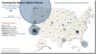
Map of Bank Failures Jan-08 to June 09
26 May 2009The interesting part are the bubble roll-overs: they show who tookover each bank’s assets, and how much each closure cost the FDIC.
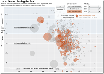
Stressing the Rest
19 May 2009The WSJ stress-tested 900+ smaller banks. Sort by stress scenario, size, state, and tarp-recipients. Related article.
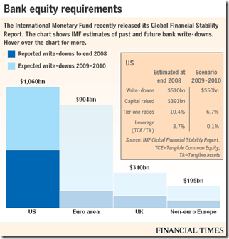
Writedown Estimates (again)
In: Bailout Finance Global Economy Interactive Source: FT US Economy
14 May 2009As we noted a couple weeks ago, the IMF released estimates of bank writedowns past and future in this years GFSR. Below is today’s FT interactive graphic of the same info (the total is $4 trillion if you were wondering).
Executive Compensation 2008
In: Bailout Employment Finance Interactive Source: USA Today US Economy
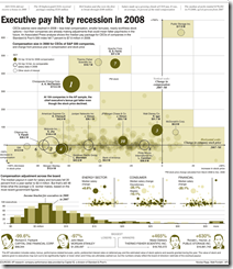
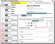
5 May 2009A nice presentation from USA today which shows salary, bonuses, stock options, other compensation. versus stock performance. Also allows you to filter by industry using the tabs at top. Related article.
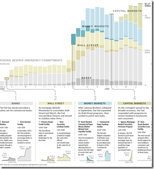
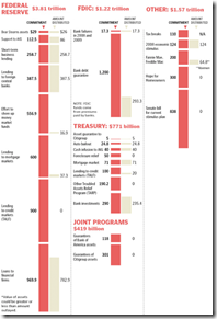
The Fed’s Trillion
5 May 2009Execute Compensation
1 May 2009$4 Trillion in losses
21 Apr 2009From the IMF’s latest Global Financial Stability Report, released today: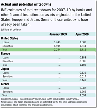
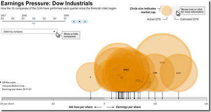
Dow Jones Quarterly Earnings
17 Apr 2009Financial Infographics
15 Apr 2009Some nice presentations from creditloan.com:
Why everyone hates AIG:
US Stimulus Package breakdown:
Corporate bailouts since 1970:
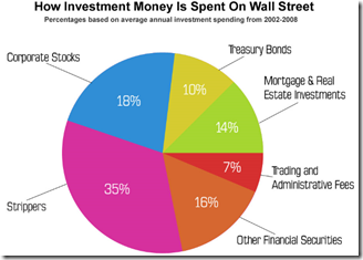
the USA’s credit rating (below left) and How investment money is spent on wall street (below right. and I knew it!)
Global Equity Performance Map
In: Emerging Markets Finance Global Economy Interactive Maps Source: FT Stock Market Updated regularly US Economy
14 Apr 2009Interactive map displays the performance of all the major global equity markets for today, or versus a selection of time periods (5days/10days/1month/etc up to a year). You can also click on any exchange to drill down to more information.
[Note: There is no direct link to the map (silly java), you have to click on the "Market Macromap" window on this page]
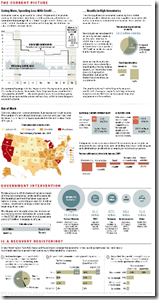
Economic State of the Union
In: Bailout Employment Finance Housing Source: Washington Post US Economy
8 Apr 2009A little dated now, but I didn’t come across the online version of this until today. it’d be nice if they kept it up to date.
Another Bailout Summary
8 Apr 2009US Intervention Programs
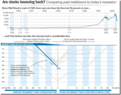
8 Apr 2009Recession Comparison
8 Apr 2009Interactive toy that bases recessions around the “bottoms”, from nicolasrapp.
What is Chart Porn?
An addictive collection of beautiful charts, graphs, maps, and interactive data visualization toys -- on topics from around the world.
Categories
- Bailout (118)
- Chartporn Related (3)
- Commentary (21)
- Culture (669)
- Emerging Markets (66)
- Employment (245)
- Environment/weather (133)
- Finance (298)
- Food (92)
- Global Economy (373)
- Graphic Design (bad) (26)
- Graphic Design (general) (183)
- Graphic Tools (23)
- History (158)
- Housing (162)
- Humor (204)
- Innovative (183)
- Interactive (545)
- Internet/tech (97)
- Maps (578)
- News Media (34)
- Politics (329)
- Reference (97)
- Science (331)
- Source: Economist (101)
- Source: FT (92)
- Source: NYT (147)
- Source: Ritholtz (76)
- Source: USA Today (27)
- Source: Washington Post (90)
- Source: WSJ (135)
- Sports (58)
- Stock Market (74)
- Uncategorized (2)
- Updated regularly (76)
- US Economy (553)
- Video (22)
- Aram Korevaar: This chart is now being used as a projection in which countries such as China see themselves as in a [...]
- David: Welcome back Chart Porn! [...]
- J S: Thanks for the great story. Miss reading this blog. Hope to see you more active again. [...]
- jake: I lived in a DC row house for 6 years, and I'm writing this comment from my tiny 1 bedroom apartment [...]
- ronny pettersen: Hilarious and unfortunately accurate... ;-) [...]

