Finance Archive:
Yet Another Recovery Index
In: Bailout Employment Finance Housing Updated regularly US Economy
22 Jun 2009This one from Kiplinger. Pretty standard stuff – a color-coded summary and charts for each of six components. Uses a pretty weak (but easy to understand) recovery threshold: “When at least three of the six indicators go fully positive — with a check mark from us — it’s more than likely that the recession has ended.” The "watch for" section of each indicator are interesting.
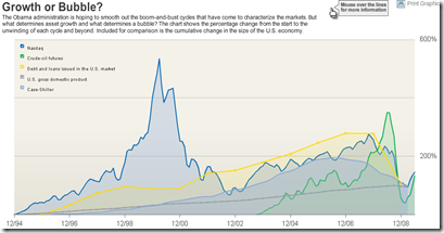
Bubbles 1994-2009
In: Bailout Finance Housing Reference Source: WSJ Stock Market US Economy
18 Jun 2009A good chart of US bubbles. The print version (p.A8, 6/18/09) had much better aesthetics. but the data are the same. Related article.
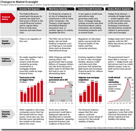
US Financial Oversight Proposals
18 Jun 2009A table summarizing the oversight reforms proposed on Wednesday. Related Washpost article.
US Economic Stress Index (April 09 data)
In: Employment Finance Housing Interactive Maps Updated regularly US Economy
16 Jun 2009AP added to an already good interactive chart this month – you can now click through different periods with the slider at the bottom. The map displays unemployment, foreclosures, bankruptcy, or a composite “stress index”, by county. In the upper right you can change the period the %-change is calculated for. Double click on a region to zoom in; click&hold to move around.
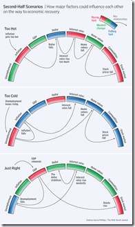
Perfect Landing
In: Bailout Employment Finance Housing Innovative Reference Source: WSJ
15 Jun 2009Ritholtz spotted this nice WSJ graphic on the importance of executing the Fed’s recession exit strategy just right. Related WSJ article.
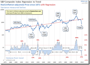
Regression to the Trend
14 Jun 2009Dshort’s June update of one of my favorite charts (inflation adjusted bullish version). Makes me wonder if we’re just going to re-inflate the bubble without any real correction.
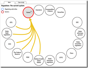
Overlapping Banking Supervision
14 Jun 2009Interactive chart from FT. Related article.
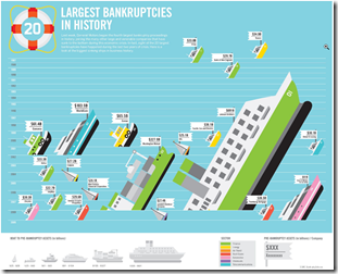
Largest Bankruptcies Ever
14 Jun 2009(Hat-tip to dataviz for the find)
USAToday Economic Outlook Index
In: Finance Housing Interactive Reference Source: USA Today Updated regularly US Economy
11 Jun 2009USA Today and IHS Global Insight have created a new USA economic outlook index based on 11 “leading” indicators. The interactive charts are very well done, with roll-over data point info, and an explanation of what each indicator means. Notes at the bottom of the page describe how the methodology differs from the Conference Board’s “leading indicators”. They plan to update it monthly. USAtoday has come a long way from the crappy charts they used to produce (ok, a lot of them are still crappy – but this one’s damn good).
(note: I spotted this one because Utah has crappy newspapers and my only option for any actual news of the world was USAToday)
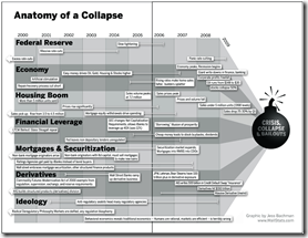
Anatomy of the Crash
In: Bailout Finance Innovative Reference Source: Ritholtz US Economy
10 Jun 2009(Sorry there haven’t been many updates lately – I’m on vacation in the Colorado mountains.) Here is a infographic from Barry Ritholtz’s book Bailout Nation that does a great job showing the different causes of the crash, and how they developed over time:
Federal Home Loan Bank Investments
In: Finance Housing US Economy
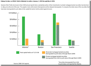
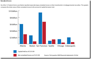
29 May 2009Worrisome analysis from SubsidyScope:
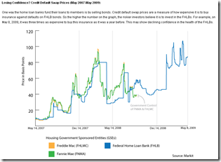
“The Federal Home Loan Banks, or FHLBs, may be the biggest financial players you’ve never heard of. Collectively, they hold $1.3 trillion in assets and are the largest U.S. borrower after the federal government.
A Subsidyscope review of the FHLBs’ financial statements has found that several of the banks are carrying substantial “unrealized losses” on their investments in mortgage-backed securities. [.]
What’s potentially worrisome is the sheer size of the losses. For the Federal Home Loan Bank of Seattle, they are substantially larger than the capital the bank holds to protect itself against such declines.”
SubsidyScope Bailout Visualizations
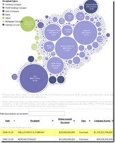
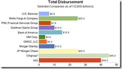
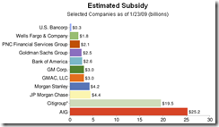
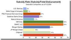
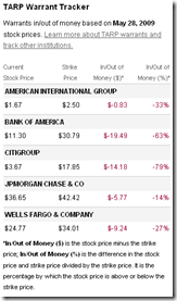
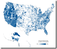
29 May 2009Created by the Pew Charitable Trusts, SubsidyScope.com has some interesting visualizations, and looks to be a great resource for tracking these issues going forward. The blog on the front page is great as well.
Tarp disbursements by recipient or date, and the transaction table at the bottom keeps up with your mouse clicks:
Estimates of the subsidy rates (also a good read on how TARP works):
Value of TARP government warrants:
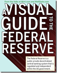
Visual Guide to the Federal Reserve
29 May 2009The FT 500
In: Finance Global Economy Interactive Source: FT Stock Market US Economy
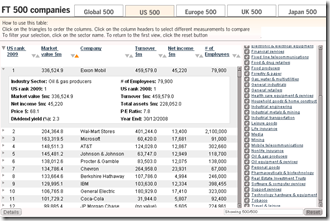
29 May 2009Interactive table of top 500 companies in the world (and for US/EU/UK/Japan) by market cap. You can sort any column, filter by sector, and drill down each company to see stats and historical rankings.
What is Chart Porn?
An addictive collection of beautiful charts, graphs, maps, and interactive data visualization toys -- on topics from around the world.
Categories
- Bailout (118)
- Chartporn Related (3)
- Commentary (21)
- Culture (669)
- Emerging Markets (66)
- Employment (245)
- Environment/weather (133)
- Finance (298)
- Food (92)
- Global Economy (373)
- Graphic Design (bad) (26)
- Graphic Design (general) (183)
- Graphic Tools (23)
- History (158)
- Housing (162)
- Humor (204)
- Innovative (183)
- Interactive (545)
- Internet/tech (97)
- Maps (578)
- News Media (34)
- Politics (329)
- Reference (97)
- Science (331)
- Source: Economist (101)
- Source: FT (92)
- Source: NYT (147)
- Source: Ritholtz (76)
- Source: USA Today (27)
- Source: Washington Post (90)
- Source: WSJ (135)
- Sports (58)
- Stock Market (74)
- Uncategorized (2)
- Updated regularly (76)
- US Economy (553)
- Video (22)
- Aram Korevaar: This chart is now being used as a projection in which countries such as China see themselves as in a [...]
- David: Welcome back Chart Porn! [...]
- J S: Thanks for the great story. Miss reading this blog. Hope to see you more active again. [...]
- jake: I lived in a DC row house for 6 years, and I'm writing this comment from my tiny 1 bedroom apartment [...]
- ronny pettersen: Hilarious and unfortunately accurate... ;-) [...]


