Finance Archive:
Bank Bonuses
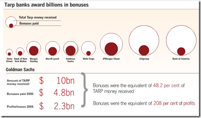
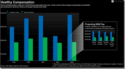
3 Aug 2009Lots of talk last week about Wall Street still paying huge bonuses. Related article.
Stock Exchange Capitalization Map
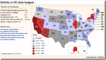
29 Jul 2009US States’ Fiscal Problem
13 Jul 2009As of 5/15/09. Roll-overs provide detailed data. Related article.
WSJ Economist Survey (July 09 edition)
In: Bailout Employment Finance Housing Interactive Source: WSJ Updated regularly US Economy
12 Jul 2009Interactive results of a survey of 54 economists, on a number of indicators and issues. Updated Monthly. Related article.
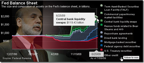
Fed Balance Sheet
12 Jul 2009Six Things That Could Make It Worse
11 Jul 2009Fancy Debt Clock
In: Finance Innovative Reference Updated regularly US Economy
8 Jul 2009Always depressing, this version of the debt clock includes running values of many different kinds of debt, GDP, trade deficits, unfunded liabilities, and other ways we are shooting ourselves in the foot every day. The “about” section is pretty bleak on source details (to put it mildly). Thanks to my friend Jenny Butler for the link.
Tackling Inflation
In: Finance Global Economy Source: FT Updated regularly US Economy
2 Jul 2009Interactive display of central bank interest rates. It would be useful if you could scroll in and enlarge the last couple years, obviously. It looks like they might update this regularly.
To be fair, 2009 values are analyst “estimates”. Related article.
USA Today Economic Outlook Index (June edition)
In: Finance Housing Interactive Reference Source: USA Today Updated regularly US Economy
29 Jun 2009Updated June 24th. The best part is the lower chart showing the latest data for each of the 11 “leading indicators”.
Detailed Timelines of the Financial Crisis
In: Bailout Finance Global Economy Interactive Reference Updated regularly US Economy
29 Jun 2009Ok, obviously it’s NY Fed day at ChartPorn. Interactive PDF files (click on events to jump to more details) provide a detailed list of policy actions and events. It is supposedly updated the 1st of every month.
There is both a domestic version, organized by Fed Policy Actions/Market Events/Other Policy Actions:
And an international (G7) version, organized by Bank Liability Guarantees/Liquidity and Rescue Interventions/Other Market Interventions:
Credit Card and Mortgage Delinquency Map
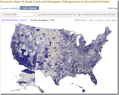
29 Jun 2009From the NY Fed. Data available by county.
Investment Banking (1st Half 2009 update)
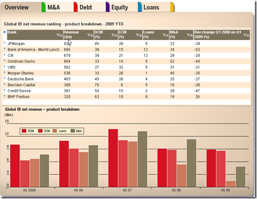
26 Jun 2009The FT has updated its interactive tables of investment banking activity. Lots of good data in here.
Financial Reform
In: Finance Global Economy Source: FT Source: NYT Source: Ritholtz Stock Market US Economy
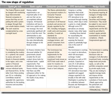
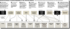
23 Jun 2009Summary of EU and US reforms. The related article is a very good read on the subject.
NYT’s version of just the USA (hat-tip to Ritholtz). Related article.
What is Chart Porn?
An addictive collection of beautiful charts, graphs, maps, and interactive data visualization toys -- on topics from around the world.
Categories
- Bailout (118)
- Chartporn Related (3)
- Commentary (21)
- Culture (669)
- Emerging Markets (66)
- Employment (245)
- Environment/weather (133)
- Finance (298)
- Food (92)
- Global Economy (373)
- Graphic Design (bad) (26)
- Graphic Design (general) (183)
- Graphic Tools (23)
- History (158)
- Housing (162)
- Humor (204)
- Innovative (183)
- Interactive (545)
- Internet/tech (97)
- Maps (578)
- News Media (34)
- Politics (329)
- Reference (97)
- Science (331)
- Source: Economist (101)
- Source: FT (92)
- Source: NYT (147)
- Source: Ritholtz (76)
- Source: USA Today (27)
- Source: Washington Post (90)
- Source: WSJ (135)
- Sports (58)
- Stock Market (74)
- Uncategorized (2)
- Updated regularly (76)
- US Economy (553)
- Video (22)
- Aram Korevaar: This chart is now being used as a projection in which countries such as China see themselves as in a [...]
- David: Welcome back Chart Porn! [...]
- J S: Thanks for the great story. Miss reading this blog. Hope to see you more active again. [...]
- jake: I lived in a DC row house for 6 years, and I'm writing this comment from my tiny 1 bedroom apartment [...]
- ronny pettersen: Hilarious and unfortunately accurate... ;-) [...]

