Finance Archive:
Bailout Update
22 Sep 2009Bailout Matrices
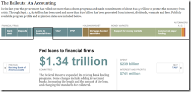
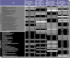
21 Sep 2009I question the value of “Bold/Weak” as an axis. but it’s still interesting to look at. Related CNNMoney article.
More interesting: Change in stock price one year later, versus level of federal assistance:
Brookings Metro Monitor (Sept 09 report)
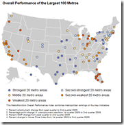
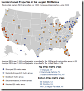
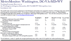
21 Sep 2009Brookings is tracking the economic health of 100 USA metro areas using a variety of indicators. Below are the maps for overall performance and REOs (there are more on the site). You can look up summary reports for individual cities. Also interesting are the rankings, which appear in the appendix of the full report.
FDI Continues to Fall
In: Emerging Markets Finance Global Economy Source: Economist
21 Sep 2009Not News to Anyone…
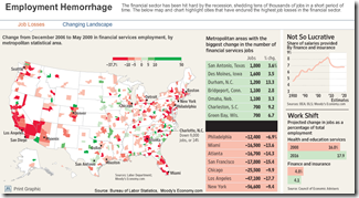
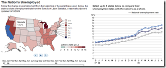
21 Sep 2009Two employment graphics from the WSJ:
Financial sector job losses (more spread out than I would have suspected). Related article.
State-by-State, with a timeline slider Dec 07 through August.
G20 Pittsburgh
21 Sep 2009Interactive tool for grasping what the G20 has said, and done, over the last three summits.
In depth G20 coverage from the FT is available here.
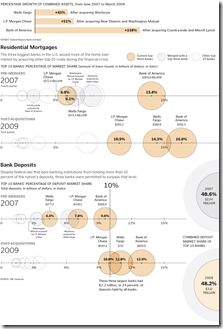
Related article. Once again, spotted over at Infectious Greed (I really should go there more often).
One Crisis Later
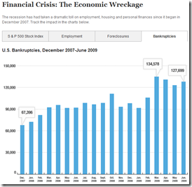
18 Sep 2009So many data releases focus (correctly) on percentage changes m-to-m or y-to-y; but once in a while it’s useful to look at the actual numbers. Below is the S&P, Employment, Foreclosures, and Bankruptcies.
Lehman Diaspora
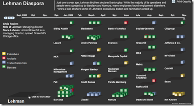
16 Sep 2009Move the timeline slider and watch former Lehman employees scatter to their new jobs. Click on blocks to see individual stories.
Crisis Timeline
16 Sep 2009Call up monthly slivers of data and related news for 6 financial market indicators (dow, treasury yields, libor, commercial yields, CDS spreads, mortgage backed spreads).
Economic Recovery Dashboard (9/15/09 update)
In: Employment Finance Innovative Interactive Reference Updated regularly US Economy
15 Sep 2009Here is this month’s update of one of my favorite presentations of economic indicators, from Russell Investments. Includes trending, useful popups, drill down links to historical data, and good descriptions of each indicator. It’s really everything an economic dashboard should look like. (ok, maybe they could animate it over time.)
Winners and Losers
13 Sep 2009Updated July 29th. The best part is the lower chart showing the latest data for each of the 11 “leading indicators”.
Financial Regulation
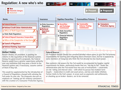
3 Aug 2009The FT has some nice charts on proposed changes to financial oversight. Related article.
What is Chart Porn?
An addictive collection of beautiful charts, graphs, maps, and interactive data visualization toys -- on topics from around the world.
Categories
- Bailout (118)
- Chartporn Related (3)
- Commentary (21)
- Culture (669)
- Emerging Markets (66)
- Employment (245)
- Environment/weather (133)
- Finance (298)
- Food (92)
- Global Economy (373)
- Graphic Design (bad) (26)
- Graphic Design (general) (183)
- Graphic Tools (23)
- History (158)
- Housing (162)
- Humor (204)
- Innovative (183)
- Interactive (545)
- Internet/tech (97)
- Maps (578)
- News Media (34)
- Politics (329)
- Reference (97)
- Science (331)
- Source: Economist (101)
- Source: FT (92)
- Source: NYT (147)
- Source: Ritholtz (76)
- Source: USA Today (27)
- Source: Washington Post (90)
- Source: WSJ (135)
- Sports (58)
- Stock Market (74)
- Uncategorized (2)
- Updated regularly (76)
- US Economy (553)
- Video (22)
- Aram Korevaar: This chart is now being used as a projection in which countries such as China see themselves as in a [...]
- David: Welcome back Chart Porn! [...]
- J S: Thanks for the great story. Miss reading this blog. Hope to see you more active again. [...]
- jake: I lived in a DC row house for 6 years, and I'm writing this comment from my tiny 1 bedroom apartment [...]
- ronny pettersen: Hilarious and unfortunately accurate... ;-) [...]

