Finance Archive:
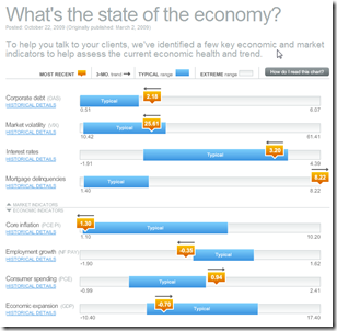
Economic Recovery Dashboard (Oct 09 ver)
24 Oct 2009October update of one of my favorite summaries of economic indicators. If you normally find this stuff confusing you should check it out — click on any of the “historical details” to see what each indicator means and why it’s important.
2008 Executive Compensation
In: Bailout Finance Interactive Source: USA Today US Economy
23 Oct 2009Credit Card Transactions
In: Finance
22 Oct 2009What happens behind the scenes. by designer Chris Edwards
BBC G20
In: Bailout Emerging Markets Finance Global Economy Interactive Maps Politics US Economy
19 Oct 2009A bit dated as these were prepared in the lead up to the Pittsburgh summit a few weeks ago. Worth passing on nonetheless.
A checklist of the G20’s April London Summit pledges and whether they’ve been fulfilled. Included some nice graphics on IMF and tax reforms.
G20 Stimulus and Fiscal Deficit map. Use the slider to look at the changes 2007-2010. Mouse over a country to view popup data details.
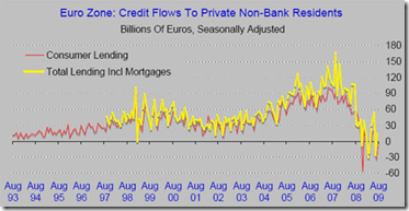
EU: Lending Down
18 Oct 2009We’ve seen this data before for the United States. The below chart confirms the same for the EU: banks are not lending.
Carry Trade
16 Oct 2009Currency Trends
In: Emerging Markets Finance Global Economy Interactive Source: FT US Economy
13 Oct 2009The FT takes a graphic look at a number of currency trends (dollar/euro, carry trade, commodity currencies, the renminbi, and a trade weighted exchange index). [the links on the below images all go to the same interactive tool]
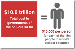
Follow the Money
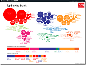
5 Oct 2009Investment Banking (updated)
In: Bailout Finance Source: FT
5 Oct 2009NYT Economic Indicators
In: Employment Finance Housing Reference Source: NYT US Economy
2 Oct 2009The NYT has a nice tiny tool that provides the most recent data for 25 economic indicators (housing, employment, production, confidence, etc). It appears at the top of their “Economy” page, and an ugly version of the flash tool can be viewed directly here.
FDI Flows
2 Oct 2009A map of foreign direct investment inflows, in percent of GDP. Somewhat oddly, you have to click on the different ratio ranges at the bottom to color the relevant countries – at a minimum, they should have included the option to see the whole map (all ranges) colored at once.
No Loans for You
28 Sep 2009A chart from the NYT illustrating lending has not begun to recover much at all. Related article.
Fun With [Banking] Data
In: Employment Finance Graphic Design (general) Reference US Economy
22 Sep 2009The St. Louis Federal Reserve has an excellent graphing tool called Fred Graph. You can view a variety of economic (not just banking) data over any time period, add/delete series at will, and download the raw data. Below is an example of commercial, consumer, and real estate loans (1940-today); and the same data zoomed in on 2007-today (note the total absence of increased lending). To start, pick a data series from the Fred Page then click on the graph itself to bring up more design options.
What is Chart Porn?
An addictive collection of beautiful charts, graphs, maps, and interactive data visualization toys -- on topics from around the world.
Categories
- Bailout (118)
- Chartporn Related (3)
- Commentary (21)
- Culture (669)
- Emerging Markets (66)
- Employment (245)
- Environment/weather (133)
- Finance (298)
- Food (92)
- Global Economy (373)
- Graphic Design (bad) (26)
- Graphic Design (general) (183)
- Graphic Tools (23)
- History (158)
- Housing (162)
- Humor (204)
- Innovative (183)
- Interactive (545)
- Internet/tech (97)
- Maps (578)
- News Media (34)
- Politics (329)
- Reference (97)
- Science (331)
- Source: Economist (101)
- Source: FT (92)
- Source: NYT (147)
- Source: Ritholtz (76)
- Source: USA Today (27)
- Source: Washington Post (90)
- Source: WSJ (135)
- Sports (58)
- Stock Market (74)
- Uncategorized (2)
- Updated regularly (76)
- US Economy (553)
- Video (22)
- Aram Korevaar: This chart is now being used as a projection in which countries such as China see themselves as in a [...]
- David: Welcome back Chart Porn! [...]
- J S: Thanks for the great story. Miss reading this blog. Hope to see you more active again. [...]
- jake: I lived in a DC row house for 6 years, and I'm writing this comment from my tiny 1 bedroom apartment [...]
- ronny pettersen: Hilarious and unfortunately accurate... ;-) [...]









Blame the Smart People?
In: Bailout Commentary Finance Humor Source: WSJ US Economy
18 Oct 2009A WSJ op-ed that presents a convincing argument that we can’t blame stupid people for the financial crisis (though they certainly helped).