Finance Archive:
Economic Recovery Dashboard (Nov 09 ver)
In: Employment Finance Global Economy Housing Interactive US Economy
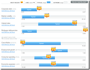
23 Nov 2009November update of one of my favorite summaries of economic indicators. If you normally find this stuff confusing you should check it out – click on any of the “historical details” to see what each indicator means and why it’s important.
Emotional Investing
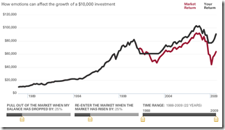
19 Nov 2009The second one from Vanguard lets you adjust when you leave and enter the market (based on market crashes/recoveries). Very cool.
Interactive Investing
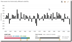
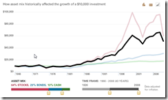
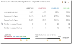
18 Nov 2009Vanguard has several interesting interactive tools for visualizing investment decisions. The first concerns investment composition. Use the sliders at the bottom to choose between stocks, bonds, and cash – and to show how your investments would have performed over any date range since 1928. Click on the little graph icons in the upper right corner to view it as data or a line chart. Thanks to Diane Fitzer for pointing them out.
China vs United States
16 Nov 2009Finance Timeline
11 Nov 2009Wall Street Stock Options
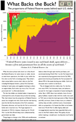
8 Nov 2009The Fed’s Changing Assets
3 Nov 2009How the composition of the Fed’s balance sheet has changed over time. I would like to have seen the past two years blown up in detail. (via Ritzholtz).
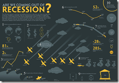
Recession Infographic
In: Finance US Economy
3 Nov 2009AP Economic Stress Map (November update)
In: Employment Finance Housing Interactive Maps Updated regularly US Economy
2 Nov 2009Updated November 2nd. The map displays unemployment, foreclosures, bankruptcy, or a composite “stress index”, by county. In the upper right you can change the period the %-change is calculated for. To look at data over time, click on the “Oct.2007 to present” option and a historical slider will appear at the bottomDouble click on a region to zoom in; click & hold to move around.
USA Today Economic Outlook Index (October edition)
In: Employment Finance Housing Interactive Stock Market US Economy
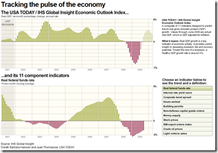
2 Nov 2009Updated October 28th. The best part is the lower chart showing the latest data for each of the 11 “leading indicators”.
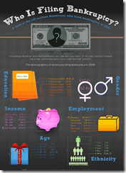
Going for Broke
In: Culture Finance US Economy
28 Oct 2009Who Owns Mortgages?
In: Finance Housing US Economy
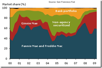
26 Oct 2009Fannie Mae and Freddie Mac combined have consistently been the largest players in the market, owning or guaranteeing about half or more of the mortgages in the sample at any given time. Non-agency securitization peaked in the first quarter of 2006, when it accounted for nearly 40% of new originations. Finally, the share of mortgages retained in the originating institution’s portfolio averaged about 15% throughout the boom, but has fallen considerably since. (from SF Fed via Calculated Risk)
Visual History of The Federal Reserve
26 Oct 2009Available as a print or free PDF file, from Financial Graph and Art. (via Ritholtz)
UK Quantitative Easing
26 Oct 2009Cumulative total of gilt purchases by the Bank of England. Related article. <insert generic comment about how the mind doesn’t easily distinguish arc lengths in spiral charts>
What is Chart Porn?
An addictive collection of beautiful charts, graphs, maps, and interactive data visualization toys -- on topics from around the world.
Categories
- Bailout (118)
- Chartporn Related (3)
- Commentary (21)
- Culture (669)
- Emerging Markets (66)
- Employment (245)
- Environment/weather (133)
- Finance (298)
- Food (92)
- Global Economy (373)
- Graphic Design (bad) (26)
- Graphic Design (general) (183)
- Graphic Tools (23)
- History (158)
- Housing (162)
- Humor (204)
- Innovative (183)
- Interactive (545)
- Internet/tech (97)
- Maps (578)
- News Media (34)
- Politics (329)
- Reference (97)
- Science (331)
- Source: Economist (101)
- Source: FT (92)
- Source: NYT (147)
- Source: Ritholtz (76)
- Source: USA Today (27)
- Source: Washington Post (90)
- Source: WSJ (135)
- Sports (58)
- Stock Market (74)
- Uncategorized (2)
- Updated regularly (76)
- US Economy (553)
- Video (22)
- Aram Korevaar: This chart is now being used as a projection in which countries such as China see themselves as in a [...]
- David: Welcome back Chart Porn! [...]
- J S: Thanks for the great story. Miss reading this blog. Hope to see you more active again. [...]
- jake: I lived in a DC row house for 6 years, and I'm writing this comment from my tiny 1 bedroom apartment [...]
- ronny pettersen: Hilarious and unfortunately accurate... ;-) [...]

