Environment/weather Archive:
Climate Anomalies, 2007-09
14 Dec 2009Global Warming Skeptics vs Consensus
10 Dec 2009Copenhagen
In: Environment/weather Interactive Maps Science Source: NYT
9 Dec 2009Personal Carbon Calculator
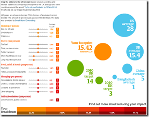
2 Dec 2009Modify your habits from the “average” and see how it impacts your footprint. Click on the ?’s to see what’s behind each category. There’s some discussion of the methodology here.
Great Lakes Infographic
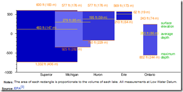
16 Nov 2009Combines relative elevation, depth, and volume. I’m not so sure they needed to be overlapping (maybe vertically staked would have been better?), but it’s still a nice graphic. (from wikipedia’s Great Lakes page, via Kelso’s corner)
Dogs are Bad for the Environment
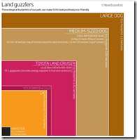
8 Nov 2009An odd graphic looking at the green footprint of pets; based on a New Scientist article.
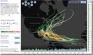
Hurricane Tracker
8 Nov 2009Another historical look at hurricanes. This one has a number of very interesting filters and sliders. I wish someone would do something like this for recessions (not on a map, obviously). (via Vizworld)
Death by “Natural Causes”
5 Nov 2009Stats on animal related deaths, with some odd first-person descriptions. (via fancystats)
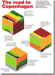
World Opinions on Climate Change
29 Oct 2009An interesting use of 3d cubes to display polling results. The polling questions are also much better constructed than the usual “do you think climate change is happening?”
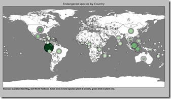
Endangered Species Map
25 Oct 2009Hidden Content
21 Oct 2009I’m starting to think that Good must be TRYING to design these so poorly. I suppose it’s one way to get us to notice the data (since we have to hunt around for it). I’ll leave it to JunkCharts or someone else to enumerate the number of ways this is bad.
Coal Plants
21 Oct 2009Coal is central to a lot of energy and environment issues, but I’d never seen a map of where they were.
Environmental Trends and Basic Data
18 Oct 2009I like this one because it uses colors to represent trends, which is nice when you are trying to display indicators that are on completely different scales.
The same site, the United Nations Environment Programme, has a number of great environment-related infographics:
Blog Action Day 2009: Climate Change
15 Oct 2009In honor of today being 2009’s Blog Action Day, I present below a series of recent climate change visualizations:
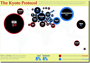
First up, “Kyoto: Who’s on Target”, which uses interesting nested circles for indicators of compliance. (via)
From the Washington Post, an interactive view of carbon emissions from G20 countries (either total or per capita) with a slider to move from 1950 through 2006. Easily missed, you can also click on a countries name on a list below that bubble chart (or on the “country profile” tab) to drilldown to individual countries. The October 5 part of the “special report” also contained a nice overview map.
Next, a treemap of cumulative CO2 emissions (1751-2006):
Breathing Earth‘s CO2 emissions simulator:
another interactive CO2 emissions map:
and if you doubt what effects CO2 levels are having, and whether global warming is something to worry about, please go read the “Global Climate Change Impacts in the United States” report.
or take a look at the Climate Orb, which is gathering stories of environmental impacts around the globe:
What is Chart Porn?
An addictive collection of beautiful charts, graphs, maps, and interactive data visualization toys -- on topics from around the world.
Categories
- Bailout (118)
- Chartporn Related (3)
- Commentary (21)
- Culture (669)
- Emerging Markets (66)
- Employment (245)
- Environment/weather (133)
- Finance (298)
- Food (92)
- Global Economy (373)
- Graphic Design (bad) (26)
- Graphic Design (general) (183)
- Graphic Tools (23)
- History (158)
- Housing (162)
- Humor (204)
- Innovative (183)
- Interactive (545)
- Internet/tech (97)
- Maps (578)
- News Media (34)
- Politics (329)
- Reference (97)
- Science (331)
- Source: Economist (101)
- Source: FT (92)
- Source: NYT (147)
- Source: Ritholtz (76)
- Source: USA Today (27)
- Source: Washington Post (90)
- Source: WSJ (135)
- Sports (58)
- Stock Market (74)
- Uncategorized (2)
- Updated regularly (76)
- US Economy (553)
- Video (22)
- Aram Korevaar: This chart is now being used as a projection in which countries such as China see themselves as in a [...]
- David: Welcome back Chart Porn! [...]
- J S: Thanks for the great story. Miss reading this blog. Hope to see you more active again. [...]
- jake: I lived in a DC row house for 6 years, and I'm writing this comment from my tiny 1 bedroom apartment [...]
- ronny pettersen: Hilarious and unfortunately accurate... ;-) [...]


