Environment/weather Archive:
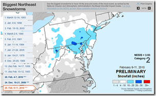
Northeast Snowpocalypses
28 Feb 2010Biggest NE storms of all time. Strangely, excludes the Blizzard of ’77, which I remember in upstate NY.
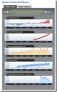
Global Climate Dashboard
17 Feb 2010From NOAA. Nice quick display of data and indices.
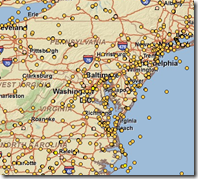
They also have an interactive Map of weather stations from which you can download raw data:
Crowdsourcing Crisis Management
31 Jan 2010Several articles about the Ushahidi system : TED blog. Washington post. Guardian.
Winter Weather – ummmm and More Weather
In: Environment/weather Interactive Maps Science Source: USA Today
29 Jan 2010I think most of us absorbed this in earth science class, but if you need a refresher on how different air layers create different types of precipitation, here it is. (Also, the animations are quite pretty).
Looking around the site it turns out this is just one in a very large series of weather related interactives. Check it out. Some very cool stuff, including my hometown favorite: Lake Effect Snow (Irondequoit, NY).
Large Earthquakes 1990-2005
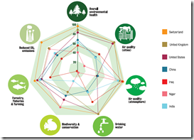
25 Jan 2010Environment Performance Index
22 Jan 2010The Environmental Performance Index – developed by scientists at Columbia and Yale – aims to aggregate various countries’ performance across environmental indicators, and give each an overall mark out of 100.
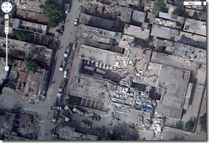
New Haiti Satellite Pictures
20 Jan 2010Google has released a series of higher quality satellite pictures taken on Jan 17th. Crazy resolution of the destruction.
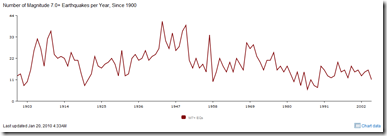
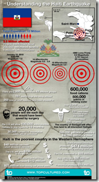
Understanding Haiti’s Earthquakes
20 Jan 2010Trends
In: Culture Environment/weather Global Economy Politics Science
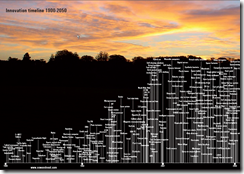
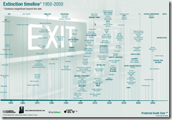
19 Jan 2010Nowandnext.com has a number of interesting timelines. Thanks to Sam Freund for pointing them out!
Haiti
In: Culture Environment/weather Global Economy Maps Science Source: NYT Source: USA Today Source: Washington Post Source: WSJ
15 Jan 2010Crazy amount of damage. and Haiti wasn’t in very good shape to start with. I’ll keep adding finds to this same post as I come across them.
I kept hearing that the shipping port was out of commission and was wondering what exactly that meant. Here it is. (via Washington Post print edition) 
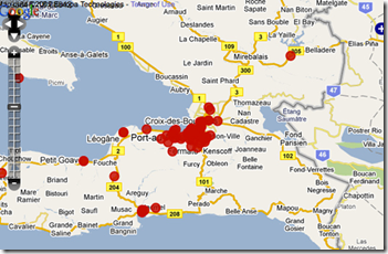
Damage zone and location of aftershocks : 
Faultlines, cities, population density, shaking: 
Zoomable satellite map of Port-au-Prince from 10:30 Wednesday:
NYT side-by-side before and after satellite pictures: 
Auto Charts
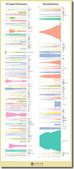
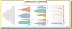
12 Jan 2010The UNEP GEO Data Portal has recently automated some chart production with a custom Illustrator script, for cross-country comparison purposes. The below example is for total CO2 emissions vs per capita. While I really like the waveform-type display aesthetically, I’m not sure of it’s analytical value compared to a bar chart.
It works a little better here (Total Final Energy Consumption):
Climate Wizard
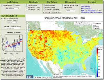
6 Jan 2010Take a look at temperature changes over the past 50 years, then select from several different models to simulate changes for the next 100. Produced by the Nature Conservancy, University of Washington, and University of Southern Mississippi, the amount of detail and explanation is welcome versus some of the more popular projection maps out there. (via)
Global Energy Consumption
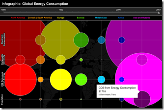
18 Dec 2009Interactive timeline of electricity, CO2, and population, 1980-2007. (via VizWorld)
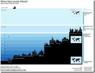
Four Degrees? So what?
14 Dec 2009What is Chart Porn?
An addictive collection of beautiful charts, graphs, maps, and interactive data visualization toys -- on topics from around the world.
Categories
- Bailout (118)
- Chartporn Related (3)
- Commentary (21)
- Culture (669)
- Emerging Markets (66)
- Employment (245)
- Environment/weather (133)
- Finance (298)
- Food (92)
- Global Economy (373)
- Graphic Design (bad) (26)
- Graphic Design (general) (183)
- Graphic Tools (23)
- History (158)
- Housing (162)
- Humor (204)
- Innovative (183)
- Interactive (545)
- Internet/tech (97)
- Maps (578)
- News Media (34)
- Politics (329)
- Reference (97)
- Science (331)
- Source: Economist (101)
- Source: FT (92)
- Source: NYT (147)
- Source: Ritholtz (76)
- Source: USA Today (27)
- Source: Washington Post (90)
- Source: WSJ (135)
- Sports (58)
- Stock Market (74)
- Uncategorized (2)
- Updated regularly (76)
- US Economy (553)
- Video (22)
- Aram Korevaar: This chart is now being used as a projection in which countries such as China see themselves as in a [...]
- David: Welcome back Chart Porn! [...]
- J S: Thanks for the great story. Miss reading this blog. Hope to see you more active again. [...]
- jake: I lived in a DC row house for 6 years, and I'm writing this comment from my tiny 1 bedroom apartment [...]
- ronny pettersen: Hilarious and unfortunately accurate... ;-) [...]

