Environment/weather Archive:
Man vs Volcano
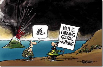
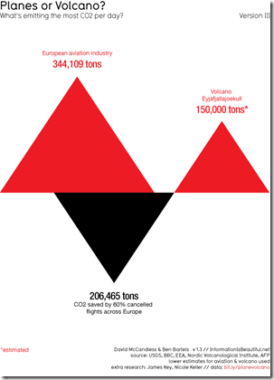
23 Apr 2010I love political cartoons in general. but strong characterizations don’t always correspond with reality.
The image:
Actual comparison:
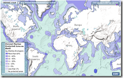
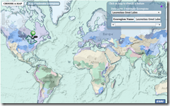
Atlas of Global Conservation
In: Environment/weather Interactive Maps Science Source: Washington Post
12 Apr 2010The Nature Conservancy has developed an atlas of ecodiversity and conservation. The hard copy will be published on Earth Day 2010, but some maps are available online now.(Related Washington Post article and photo gallery).
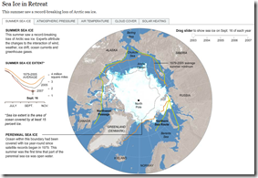
Sea Ice in Retreat?
In: Environment/weather Interactive Maps Science Source: NYT
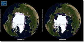
25 Mar 2010I really liked the below NYT feature until I realized it was from 2007.
Looking around, I found this quicktime movie that shows 1979-2009:
So 2007 was a bad year, but now it’s rebounding? Well, not really.
So is it melting or not? I recommend watching the below:
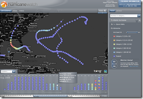
Hurricane Watch
20 Mar 2010Seasonal Flickr Colors
19 Mar 2010The graphic presents Flickr pictures of Boston Commons by color. March is at top, time progressing clockwise. I’d love to see this for a wider range of locations. (via Mark McDonald)
Insurance Losses from Natural Disasters
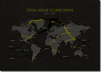
18 Mar 2010Solar Eclipse Map 2001-25
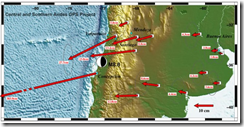
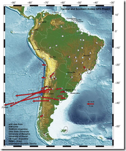
14 Mar 2010Based on GPS data, the entire city of Concepcion moved 10 feet to the west. Note that in the maps below the arrow scale and map scale are different – it looks a little odd at first, but makes sense.
Climate Change Keeps Fighting
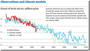
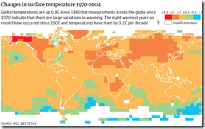
8 Mar 2010Climate change scientists have started a fightback against sceptics who argue that the observed changes in the Earth’s climate can largely be explained by natural variability. This comes after the email hacking furore.
A major Met Office review of more than 100 scientific studies tracking the observed changes in the Earth’s climate system finds that it is an "increasingly remote possibility" that human activity is not the main cause of climate change
What is Chart Porn?
An addictive collection of beautiful charts, graphs, maps, and interactive data visualization toys -- on topics from around the world.
Categories
- Bailout (118)
- Chartporn Related (3)
- Commentary (21)
- Culture (669)
- Emerging Markets (66)
- Employment (245)
- Environment/weather (133)
- Finance (298)
- Food (92)
- Global Economy (373)
- Graphic Design (bad) (26)
- Graphic Design (general) (183)
- Graphic Tools (23)
- History (158)
- Housing (162)
- Humor (204)
- Innovative (183)
- Interactive (545)
- Internet/tech (97)
- Maps (578)
- News Media (34)
- Politics (329)
- Reference (97)
- Science (331)
- Source: Economist (101)
- Source: FT (92)
- Source: NYT (147)
- Source: Ritholtz (76)
- Source: USA Today (27)
- Source: Washington Post (90)
- Source: WSJ (135)
- Sports (58)
- Stock Market (74)
- Uncategorized (2)
- Updated regularly (76)
- US Economy (553)
- Video (22)
- Aram Korevaar: This chart is now being used as a projection in which countries such as China see themselves as in a [...]
- David: Welcome back Chart Porn! [...]
- J S: Thanks for the great story. Miss reading this blog. Hope to see you more active again. [...]
- jake: I lived in a DC row house for 6 years, and I'm writing this comment from my tiny 1 bedroom apartment [...]
- ronny pettersen: Hilarious and unfortunately accurate... ;-) [...]

