Employment Archive:
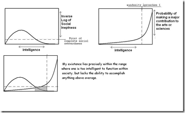
The Truth About Most Artists/Scientists
In: Employment Humor Science
25 Jul 2010I think you could make a nice series of charts like this about most careers.
(note: I couldn’t figure out which version of this was the original. I first saw it here)
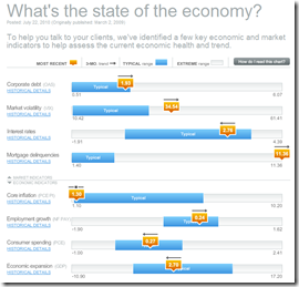
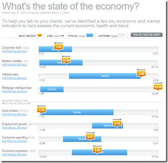
Update: Economic Indicators Dashboard (July ‘10)
23 Jul 2010A great monthly status board for market and economic indicators. Click on anything – the popup details are great.
Grandparents Competing with Teenagers for Jobs
17 Jul 2010Interesting multi-part interactive analysis from Bloomberg about changing job-force dynamics. (via the Big Picture)
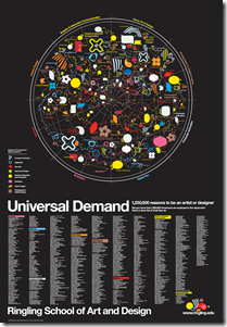
Art and Design Professions
30 Jun 2010The graphic at the top is kind of pointless, but the list of professions at the bottom might be an inspirational reference for some. By Tyler Lang – c.2007. (via)
2009: How Americans Spent Their Time
28 Jun 2010Roll-over details alleviate the normal pie-chart problems (somewhat). However, who averages 8.6 hours of sleep a day and only 3.5 hours of work? Maybe I’m just not average. The related article talks about the impact of higher unemployment on this data.
Education Documentary Trailer
21 Jun 2010Video infographics seem to be a growing trend. Here’s a well animated one in the form of a promotional for the education documentary “Waiting for Superman” (by Davis Guggenheim, who did An Inconvenient Truth). Note: if you want to see the whole movie, it is being shown as part of this weeks Silverdocs Film Festival in Washington, DC.
American Migrations: 2008
16 Jun 2010More than 10 million Americans moved from one county to another during 2008. The map below visualizes those moves. Click on any county to see comings and goings: black lines indicate net inward movement, red lines net outward movement.
Unemployment: Dream vs Reality
In: Employment Humor
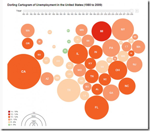
4 Jun 2010Unemployment 1980-2009
4 Jun 2010EPI’s Economy Track
In: Employment Interactive Maps Updated regularly US Economy
3 Jun 2010The Economic Policy Institute has a collection of interactive charts covering employment, GDP, and capacity utilization. There are also filters to facilitate quick comparisons across recession periods.
Unemployment Length by State
3 Jun 2010Roll-over the states for the rates. (via The Big Picture)
Economic Indicators Dashboard (May ‘10 update)
25 May 2010One of my favorite summaries of economic indicators. Click on any of the “historical details” to see what each indicator means and why it’s important.
What is Chart Porn?
An addictive collection of beautiful charts, graphs, maps, and interactive data visualization toys -- on topics from around the world.
Categories
- Bailout (118)
- Chartporn Related (3)
- Commentary (21)
- Culture (669)
- Emerging Markets (66)
- Employment (245)
- Environment/weather (133)
- Finance (298)
- Food (92)
- Global Economy (373)
- Graphic Design (bad) (26)
- Graphic Design (general) (183)
- Graphic Tools (23)
- History (158)
- Housing (162)
- Humor (204)
- Innovative (183)
- Interactive (545)
- Internet/tech (97)
- Maps (578)
- News Media (34)
- Politics (329)
- Reference (97)
- Science (331)
- Source: Economist (101)
- Source: FT (92)
- Source: NYT (147)
- Source: Ritholtz (76)
- Source: USA Today (27)
- Source: Washington Post (90)
- Source: WSJ (135)
- Sports (58)
- Stock Market (74)
- Uncategorized (2)
- Updated regularly (76)
- US Economy (553)
- Video (22)
- Aram Korevaar: This chart is now being used as a projection in which countries such as China see themselves as in a [...]
- David: Welcome back Chart Porn! [...]
- J S: Thanks for the great story. Miss reading this blog. Hope to see you more active again. [...]
- jake: I lived in a DC row house for 6 years, and I'm writing this comment from my tiny 1 bedroom apartment [...]
- ronny pettersen: Hilarious and unfortunately accurate... ;-) [...]

