Employment Archive:
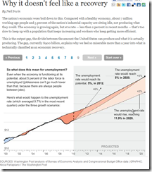
A nice animated/annotated series of charts explaining the output gap and its effects on unemployment.
Update: Wall Street Compensation
In: Employment Finance Interactive Source: WSJ Stock Market US Economy
12 Oct 2010Explore what percentage of revenue at Wall Street firms goes to compensation. Updated with 2010 data.
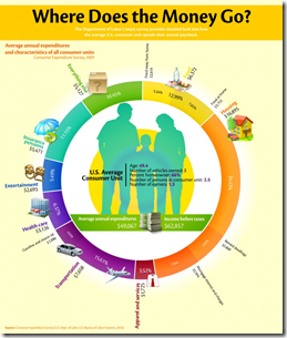
Average Expenses
In: Culture Employment
7 Oct 2010Where does your paycheck go? Survey numbers lay out the 2010 averages. (note: I am apparently soooo not average)
Update: Economic Indicators Dashboard
In: Employment Finance Housing Interactive Updated regularly US Economy
24 Sep 2010One of my favorite summaries of economic indicators. Click on any of the “historical details” to see what each indicator means and why it’s important. Updated 9/22/10.
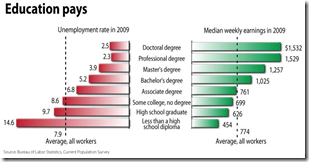
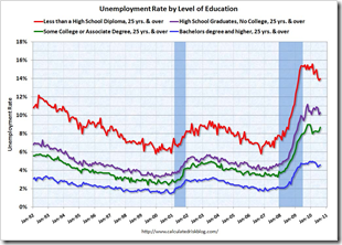
Stay in School
In: Employment
21 Sep 2010Job Happiness Index
19 Sep 2010SAT Scores (1972-2010)
15 Sep 2010College Ranking Methodologies
In: Employment
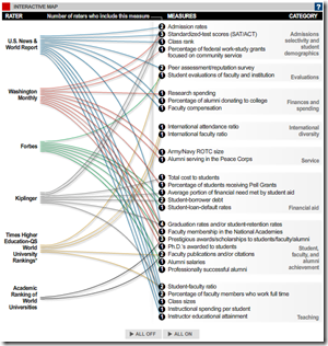
15 Sep 2010Speaking of college – here’s a comparison of six different college ratings. These probably would have been more useful a few months ago, eh?
How Americans Pay for College
In: Employment US Economy
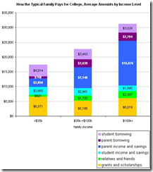
15 Sep 2010Interesting variations by income level. (via)
Breaking the Glass Ceiling
In: Culture Employment
14 Sep 2010Young single women in the majority of America’s largest cities are now earning more than their male peers. (Related Time article; NPR report)
Global Competitiveness Report 2010-11
In: Employment Finance Global Economy Interactive Maps Politics Updated regularly
10 Sep 2010The World Economic Forum has a number of interactive tools for examining the results of it’s Global Competitiveness Report. You can view the aggregate index or any of the many (very interesting) sub-components as maps, bar charts, scatter plots, rankings, or individual profiles. FYI – The United States has slipped from 2nd to 4th overall.
US Fiscal Stimulus
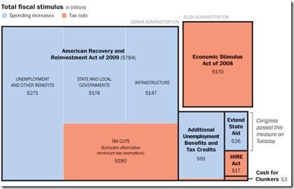
12 Aug 2010Includes the recent $26 billion state aid package. Related article.
Update: AP Economic Stress Map
2 Aug 2010This map displays unemployment, foreclosures, bankruptcies, or a composite “stress index”, by county. Easy to miss: in the upper right you can change the scale of the mapping (rates, m-t-m, y-t-y). To look at data over time, click on the “monthly rates” option and a historical slider will appear at the bottom. Double click on a region to zoom in. Updated 8/2/10.
Golden Parachutes
28 Jul 2010What is Chart Porn?
An addictive collection of beautiful charts, graphs, maps, and interactive data visualization toys -- on topics from around the world.
Categories
- Bailout (118)
- Chartporn Related (3)
- Commentary (21)
- Culture (669)
- Emerging Markets (66)
- Employment (245)
- Environment/weather (133)
- Finance (298)
- Food (92)
- Global Economy (373)
- Graphic Design (bad) (26)
- Graphic Design (general) (183)
- Graphic Tools (23)
- History (158)
- Housing (162)
- Humor (204)
- Innovative (183)
- Interactive (545)
- Internet/tech (97)
- Maps (578)
- News Media (34)
- Politics (329)
- Reference (97)
- Science (331)
- Source: Economist (101)
- Source: FT (92)
- Source: NYT (147)
- Source: Ritholtz (76)
- Source: USA Today (27)
- Source: Washington Post (90)
- Source: WSJ (135)
- Sports (58)
- Stock Market (74)
- Uncategorized (2)
- Updated regularly (76)
- US Economy (553)
- Video (22)
- Aram Korevaar: This chart is now being used as a projection in which countries such as China see themselves as in a [...]
- David: Welcome back Chart Porn! [...]
- J S: Thanks for the great story. Miss reading this blog. Hope to see you more active again. [...]
- jake: I lived in a DC row house for 6 years, and I'm writing this comment from my tiny 1 bedroom apartment [...]
- ronny pettersen: Hilarious and unfortunately accurate... ;-) [...]

