Employment Archive:
Where are the Happiest People in America?
7 Mar 2011Gallup surveyed Americans on 20 different quality of life indicators (stress, depression, health problems, job satisfaction, exercise, etc), and the New York Times threw them all on a map for contemplation. Below is the composite “Well-Being index”. Thanks to Allison Stanfill for the link! (related article)
Gallup’s website compares the indicators over time:
A similar Gallup index of “US Satisfaction” was also recently visualized by Good:
Usefulness of Education
In: Employment Humor
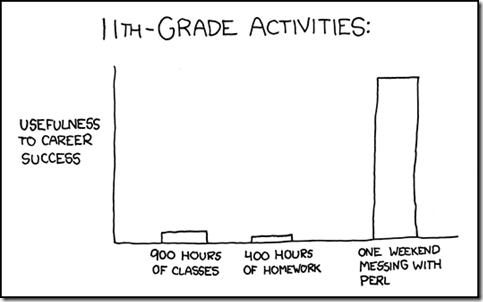
2 Mar 2011I had a conversation last night about “knowledge” education vs “skill” education that reminded me of this xkcd chart. The skills I learned hacking computers and building art projects have contributed much more to my career success than anything I learned in graduate school.
MBA Student Mobility
25 Feb 2011The Financial Times surveyed 5000+ alumni from the top 50 MBA programs in the world and mapped out where they came from, where they went to school, and where they ended up. It’s slightly confusing at first, because they do not map all of the students at once – it shows only one country of origin at a time. Still, it’s very cool if you pay attention to where the dots flow when you change categories. (related article)
note: access to some FT features requires a subscription.
It’s the Inequality Stupid
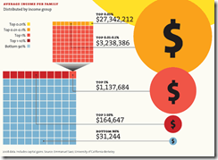
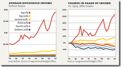
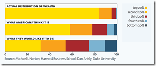
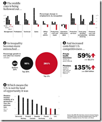
22 Feb 2011“Eight charts that explain everything that’s wrong with America”, from Mother Jones. (Thanks to Matt Brown for the link!)
Jobs that Pay Women Less
In: Employment
22 Feb 2011Women who worked full time in wage and salary jobs had median weekly earnings of $657 in 2009. This represented 80 percent of men’s median weekly earnings ($819).
But it differs a lot by industry:
(via)
American Shame
In: Culture Employment Global Economy Science Source: NYT US Economy
21 Feb 2011How America compares to other industrial countries based on a variety of basic indicators (income inequality, life expectancy, education) as well as some uncommon ones (prison population, level of democracy, and “wellbeing”). Conclusion: America is not #1! Can anyone think of indicators that WOULD make us look good in this crowd?
The Best Companies to Work For
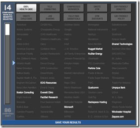
4 Feb 2011Fortune surveyed employees of 211 companies about management credibility, job satisfaction, and camaraderie, then combined that with information on pay, benefits, and management practices to rank the best companies to work for. The below interactive word cloud allows you to drill down through the words employees used the most to describe their companies.
You can also see who pays the most, and who has the best perks (explorable using the below perk-finder):
Wall Street Compensation: 2010
2 Feb 2011In 2010, total compensation and benefits at publicly traded Wall Street banks and securities firms hit a record of $135 billion […] The total is up 5.7% from $128 billion in combined compensation and benefits by the same companies in 2009.
The interactive tree-map has a nice introduction of how it works, but it would have been nice to be able to drill down further to firm level data. On the two bottom graphs, they could have combined them using the same scale so it was easier to view the revenue/profit/compensation ratios. (related article)
The US Economy in Two Visualizations
In: Employment Finance Housing Interactive Maps Updated regularly US Economy
22 Jan 2011If you want to know the state of the US economy at any time, check out the below visualizations from Russell Investments and the AP. They are both updated monthly with the latest data, allow all kinds of drilling down, and both take the time to document sources and explain why you should give a shit about these particular numbers (for example, click on any of the “historical details” links on Russell’s dashboard).
What You Don’t Know About Unemployment
11 Jan 2011We hear the big unemployment number each month (currently 9.4%), and we all know someone who’s been unemployed for a while. But how bad is it really? Let’s say I lost my job tomorrow – how bad is it out there for someone just like me? (note: if you click on the links you can enter your own attributes)
Geography?: Washington DC traditionally has higher unemployment, but it looks like that trend might soon reverse?
Age?: That’s good news. Someone my age has a slight advantage.
Sex?: Wow. I didn’t see that coming. Men have been disproportionately affected by this recession.
If you don’t mind that the data is from 2009, you can select all of the above and also add in education using the NYT visualization below. So all together, someone like me only faces a 3.9% unemployment rate – versus, say, a 15-24 yr old black male with no college, who faces a 48.5% unemployment rate. 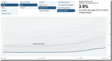
Another piece of the unemployment picture that doesn’t get much coverage is how different sectors are performing. Let’s take a look at jobs gained and lost since 2000 (note: this is in millions of jobs, not percent)
Manufacturing, construction, and retail have gotten clobbered, while government, health care, and education are about the only professions showing growth.
Well, I hope you found these tools enlightening and helped you understand that the one number they spend so much time talking about in the media doesn’t even begin to tell the whole story. If you want to dig further yourself, all of the raw data is available for download from the BLS.
American Human Development Index
In: Employment Food Housing Interactive Maps Science US Economy
21 Nov 2010Based on the idea that well-being cannot be measured by GDP alone, the Human Development Index looks at over 100 indicators, which you can explore on maps and charts at the most detailed level, or as aggregates (health, education, income). The chart display does seem to have problems separating out Washington DC, however – since we don’t actually have a congressional district — <sigh>. (via)
Income inequality and out of control costs of living. I think this could have used a few more charts – maybe one on static wages?
The Graduate Thesis Repulsor Field
10 Nov 2010The Thesis Repulsor Field is characterized by an attractor vector field directed towards completion, but accompanied by an intensive repulsive singularity at the center. Thanks to Claire for the link.
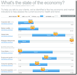
Update: The State of the Economy
25 Oct 2010October’s update of the Economic Indicators Dashboard:
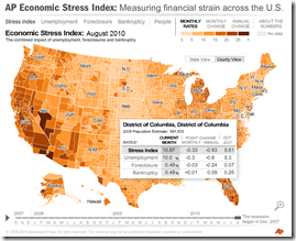
and while we’re at it, here is the AP’s Economic Stress Map, which shows unemployment, foreclosures, and bankruptcies from 2007-today, by county.
American Poverty
In: Employment Maps US Economy
22 Oct 2010And keep in mind that the “poverty rate” for a single person is less than $11,000. In other words, the majority of us should be skipping happily to work in the morning instead of popping prozac and lamenting our “tough” lives. Thanks to Kelly Brooks for the link.
What is Chart Porn?
An addictive collection of beautiful charts, graphs, maps, and interactive data visualization toys -- on topics from around the world.
Categories
- Bailout (118)
- Chartporn Related (3)
- Commentary (21)
- Culture (669)
- Emerging Markets (66)
- Employment (245)
- Environment/weather (133)
- Finance (298)
- Food (92)
- Global Economy (373)
- Graphic Design (bad) (26)
- Graphic Design (general) (183)
- Graphic Tools (23)
- History (158)
- Housing (162)
- Humor (204)
- Innovative (183)
- Interactive (545)
- Internet/tech (97)
- Maps (578)
- News Media (34)
- Politics (329)
- Reference (97)
- Science (331)
- Source: Economist (101)
- Source: FT (92)
- Source: NYT (147)
- Source: Ritholtz (76)
- Source: USA Today (27)
- Source: Washington Post (90)
- Source: WSJ (135)
- Sports (58)
- Stock Market (74)
- Uncategorized (2)
- Updated regularly (76)
- US Economy (553)
- Video (22)
- Aram Korevaar: This chart is now being used as a projection in which countries such as China see themselves as in a [...]
- David: Welcome back Chart Porn! [...]
- J S: Thanks for the great story. Miss reading this blog. Hope to see you more active again. [...]
- jake: I lived in a DC row house for 6 years, and I'm writing this comment from my tiny 1 bedroom apartment [...]
- ronny pettersen: Hilarious and unfortunately accurate... ;-) [...]


