Employment Archive:
Update: Economic Indicators Dashboard
23 Jun 2011My favorite economic status tool. Point and/or click on anything and everything to learn something new about the economy, and why you should care.
Commencement Speeches
21 Jun 2011The NYT analyzed word usage in 40 2011 commencement speeches. The results are largely what you would expect. However, the differences between private, public, and religious schools are kinda interesting. (related speeches)
Doctorate Gender Gap
In: Culture Employment
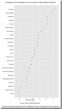
21 Jun 2011Percentage of 2009 Phd’s awarded to women, by discipline. (via)
(Not) Spreading the Wealth
20 Jun 2011What’s Your Major Worth?
24 May 2011Average earnings of different college bachelor’s degrees. Good to see engineering at the top. The most popular major?: Business – ick. The original study also breaks down earnings by gender and ethnic groups. (related Washington Post article)
Where are the Jobs?
In: Employment Interactive Source: Washington Post US Economy
20 May 2011A fantastic annotated heatmap from the Washington Post breaking down job creation/loss by sector. On the right is an interactive, slightly more annotated, line chart version of the same data. I prefer the heatmap. (related article)
Update: Economic Indicators Dashboard
25 Apr 2011Teachers Salaries World Wide
In: Culture Employment
19 Apr 2011I’m sure the devil is in the details, as usual, but aggregate statistics like this are always good background to any debate. Thanks to KD Kelly for the link!
Patchwork Nation
28 Mar 2011Patchwork Nation tracks a number of traditional economic and social indicators over time – but they also include some interesting alternative ones:
Update: Economic Indicators Dashboard
23 Mar 2011One of my favorite economic dashboards. It highlights major macro indicators, what direction they are trending, and what the typical ranges are. It also lets you drill down to explanations of why you should care, and historical values.
The Wonderful Work of Karl Hartig
In: Culture Employment Finance Graphic Design (general) History Innovative Politics Science US Economy
22 Mar 2011Karl Hartig was creating beautiful complex data visualizations back when most of us “graphics experts” were still trying to figure out how to change colors in excel. Here is a selection of his work on population, electronics, energy, stocks, immigration, politics, and music. Soak it up!
Are Public Employees Paid More?
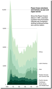
19 Mar 2011Peace Corps Volunteers
In: Culture Employment
16 Mar 2011College Degrees (1940-2009)
12 Mar 2011An interactive map of adults with college degrees. Filter by race or income or drill down to your county. I’m not sure if it’s more surprising that it went from 4.6% to 27.5%, or that we’re only at 27.5% today. How long do you suppose before someone puts this next to a red/blue state map? (via Sociological Images)
1940 vs 2009:
The Gender Gap
8 Mar 2011The Wall Street Journal has pulled together some interesting differences between the sexes concerning marital, educational, and employment trends.
What is Chart Porn?
An addictive collection of beautiful charts, graphs, maps, and interactive data visualization toys -- on topics from around the world.
Categories
- Bailout (118)
- Chartporn Related (3)
- Commentary (21)
- Culture (669)
- Emerging Markets (66)
- Employment (245)
- Environment/weather (133)
- Finance (298)
- Food (92)
- Global Economy (373)
- Graphic Design (bad) (26)
- Graphic Design (general) (183)
- Graphic Tools (23)
- History (158)
- Housing (162)
- Humor (204)
- Innovative (183)
- Interactive (545)
- Internet/tech (97)
- Maps (578)
- News Media (34)
- Politics (329)
- Reference (97)
- Science (331)
- Source: Economist (101)
- Source: FT (92)
- Source: NYT (147)
- Source: Ritholtz (76)
- Source: USA Today (27)
- Source: Washington Post (90)
- Source: WSJ (135)
- Sports (58)
- Stock Market (74)
- Uncategorized (2)
- Updated regularly (76)
- US Economy (553)
- Video (22)
- Aram Korevaar: This chart is now being used as a projection in which countries such as China see themselves as in a [...]
- David: Welcome back Chart Porn! [...]
- J S: Thanks for the great story. Miss reading this blog. Hope to see you more active again. [...]
- jake: I lived in a DC row house for 6 years, and I'm writing this comment from my tiny 1 bedroom apartment [...]
- ronny pettersen: Hilarious and unfortunately accurate... ;-) [...]


