Bailout Archive:
The Fed’s Trillion
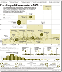
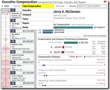
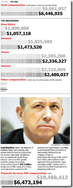
5 May 2009Execute Compensation
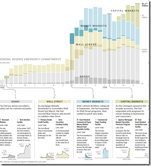
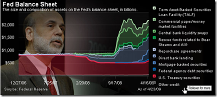
1 May 2009Fed Balance Sheet
24 Apr 2009$4 Trillion in losses
21 Apr 2009From the IMF’s latest Global Financial Stability Report, released today: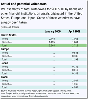
Financial Infographics
15 Apr 2009Some nice presentations from creditloan.com:
Why everyone hates AIG:
US Stimulus Package breakdown:
Corporate bailouts since 1970:
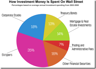
the USA’s credit rating (below left) and How investment money is spent on wall street (below right. and I knew it!)
Economic State of the Union
In: Bailout Employment Finance Housing Source: Washington Post US Economy
8 Apr 2009A little dated now, but I didn’t come across the online version of this until today. it’d be nice if they kept it up to date.
Another Bailout Summary
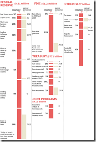
8 Apr 2009US Intervention Programs
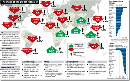
8 Apr 2009Global Recession Summary
2 Apr 2009Central Bank Salaries
30 Mar 2009An amusing list of central bank salaries. (Bernanke’s underpaid)
Of course, they don’t mention their incomes before or after service.
G-20 Stimulus Spending
In: Bailout Commentary Finance Global Economy Interactive Maps Source: Washington Post US Economy
30 Mar 2009Related Washington Post article.
Of course, not being in terms of GDP, that isn’t the best perspective.
Here’s the original data from Brookings:
And here’s a nice interactive heatmap of the plans (roll-over for country details):
What is Chart Porn?
An addictive collection of beautiful charts, graphs, maps, and interactive data visualization toys -- on topics from around the world.
Categories
- Bailout (118)
- Chartporn Related (3)
- Commentary (21)
- Culture (669)
- Emerging Markets (66)
- Employment (245)
- Environment/weather (133)
- Finance (298)
- Food (92)
- Global Economy (373)
- Graphic Design (bad) (26)
- Graphic Design (general) (183)
- Graphic Tools (23)
- History (158)
- Housing (162)
- Humor (204)
- Innovative (183)
- Interactive (545)
- Internet/tech (97)
- Maps (578)
- News Media (34)
- Politics (329)
- Reference (97)
- Science (331)
- Source: Economist (101)
- Source: FT (92)
- Source: NYT (147)
- Source: Ritholtz (76)
- Source: USA Today (27)
- Source: Washington Post (90)
- Source: WSJ (135)
- Sports (58)
- Stock Market (74)
- Uncategorized (2)
- Updated regularly (76)
- US Economy (553)
- Video (22)
- Aram Korevaar: This chart is now being used as a projection in which countries such as China see themselves as in a [...]
- David: Welcome back Chart Porn! [...]
- J S: Thanks for the great story. Miss reading this blog. Hope to see you more active again. [...]
- jake: I lived in a DC row house for 6 years, and I'm writing this comment from my tiny 1 bedroom apartment [...]
- ronny pettersen: Hilarious and unfortunately accurate... ;-) [...]







What Will It Take to Stabilize the Banks?
In: Bailout Commentary US Economy
30 Mar 2009A decent article by Martin Baily and Douglas Elliot on how big the crisis is – and comparisons of different estimates of the remaining problem: