Bailout Archive:
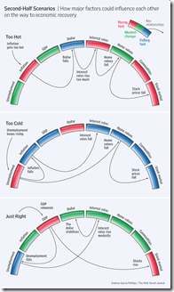
Perfect Landing
In: Bailout Employment Finance Housing Innovative Reference Source: WSJ
15 Jun 2009Ritholtz spotted this nice WSJ graphic on the importance of executing the Fed’s recession exit strategy just right. Related WSJ article.
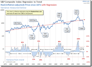
Regression to the Trend
14 Jun 2009Dshort’s June update of one of my favorite charts (inflation adjusted bullish version). Makes me wonder if we’re just going to re-inflate the bubble without any real correction.
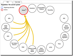
Overlapping Banking Supervision
14 Jun 2009Interactive chart from FT. Related article.
Largest Bankruptcies Ever
14 Jun 2009(Hat-tip to dataviz for the find)
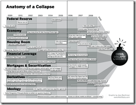
Anatomy of the Crash
In: Bailout Finance Innovative Reference Source: Ritholtz US Economy
10 Jun 2009(Sorry there haven’t been many updates lately – I’m on vacation in the Colorado mountains.) Here is a infographic from Barry Ritholtz’s book Bailout Nation that does a great job showing the different causes of the crash, and how they developed over time:
The Global GM Picture
In: Bailout Maps US Economy
2 Jun 2009US Auto Market Share 1980-2008
31 May 2009roll-overs show the ten-year data trends. What surprised me was how GM has taken the bulk of the loss, with Chrysler actually holding pretty steady.
SubsidyScope Bailout Visualizations
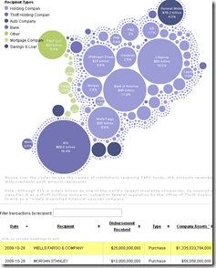
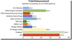
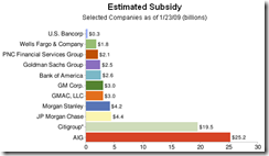
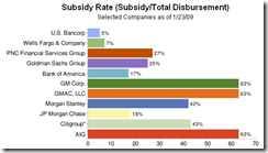
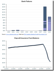
29 May 2009Created by the Pew Charitable Trusts, SubsidyScope.com has some interesting visualizations, and looks to be a great resource for tracking these issues going forward. The blog on the front page is great as well.
Tarp disbursements by recipient or date, and the transaction table at the bottom keeps up with your mouse clicks:
Estimates of the subsidy rates (also a good read on how TARP works):
Value of TARP government warrants:
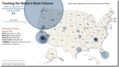
Map of Bank Failures Jan-08 to June 09
26 May 2009The interesting part are the bubble roll-overs: they show who tookover each bank’s assets, and how much each closure cost the FDIC.
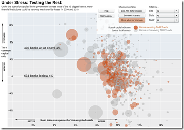
Stressing the Rest
19 May 2009The WSJ stress-tested 900+ smaller banks. Sort by stress scenario, size, state, and tarp-recipients. Related article.
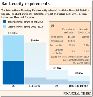
Writedown Estimates (again)
In: Bailout Finance Global Economy Interactive Source: FT US Economy
14 May 2009As we noted a couple weeks ago, the IMF released estimates of bank writedowns past and future in this years GFSR. Below is today’s FT interactive graphic of the same info (the total is $4 trillion if you were wondering).
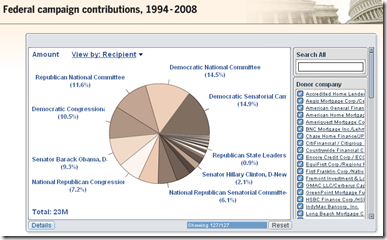
Follow the Sub-Prime Money
11 May 2009Interactive summary of $370 million in US campaign contributions made by originators of sub-prime mortgages, 1994-2008. Related article.
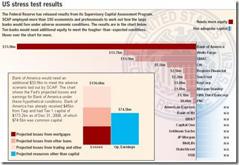
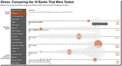
Stress Test Results (more)
11 May 2009Bank Stress Test Results
11 May 2009Executive Compensation 2008
In: Bailout Employment Finance Interactive Source: USA Today US Economy
5 May 2009A nice presentation from USA today which shows salary, bonuses, stock options, other compensation. versus stock performance. Also allows you to filter by industry using the tabs at top. Related article.
What is Chart Porn?
An addictive collection of beautiful charts, graphs, maps, and interactive data visualization toys -- on topics from around the world.
Categories
- Bailout (118)
- Chartporn Related (3)
- Commentary (21)
- Culture (669)
- Emerging Markets (66)
- Employment (245)
- Environment/weather (133)
- Finance (298)
- Food (92)
- Global Economy (373)
- Graphic Design (bad) (26)
- Graphic Design (general) (183)
- Graphic Tools (23)
- History (158)
- Housing (162)
- Humor (204)
- Innovative (183)
- Interactive (545)
- Internet/tech (97)
- Maps (578)
- News Media (34)
- Politics (329)
- Reference (97)
- Science (331)
- Source: Economist (101)
- Source: FT (92)
- Source: NYT (147)
- Source: Ritholtz (76)
- Source: USA Today (27)
- Source: Washington Post (90)
- Source: WSJ (135)
- Sports (58)
- Stock Market (74)
- Uncategorized (2)
- Updated regularly (76)
- US Economy (553)
- Video (22)
- Aram Korevaar: This chart is now being used as a projection in which countries such as China see themselves as in a [...]
- David: Welcome back Chart Porn! [...]
- J S: Thanks for the great story. Miss reading this blog. Hope to see you more active again. [...]
- jake: I lived in a DC row house for 6 years, and I'm writing this comment from my tiny 1 bedroom apartment [...]
- ronny pettersen: Hilarious and unfortunately accurate... ;-) [...]

