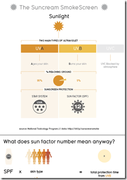
David McCandless and his team over at Information is Beautiful did a ton of research into sunscreen and threw it all into one massive infographic. It’s rather overwhelming and I’m not sure it turned out that great – and it’s kind of blurry for some reason (the excerpt over at the Guardian looks fine).
Topically speaking, I can’t help but agree with Lewis Black that it’s odd that we’ve all assimilated the idea that smearing chemicals on our skin is the healthy thing to do. Being in the sun isn’t unhealthy – not going in the sun until July and then burning to a crisp is what’s unhealthy.
Thanks to Caryn Sykes for sending in the link!
Comment Form
What is Chart Porn?
An addictive collection of beautiful charts, graphs, maps, and interactive data visualization toys -- on topics from around the world.
Categories
- Bailout (118)
- Chartporn Related (3)
- Commentary (21)
- Culture (669)
- Emerging Markets (66)
- Employment (245)
- Environment/weather (133)
- Finance (298)
- Food (92)
- Global Economy (373)
- Graphic Design (bad) (26)
- Graphic Design (general) (183)
- Graphic Tools (23)
- History (158)
- Housing (162)
- Humor (204)
- Innovative (183)
- Interactive (545)
- Internet/tech (97)
- Maps (578)
- News Media (34)
- Politics (329)
- Reference (97)
- Science (331)
- Source: Economist (101)
- Source: FT (92)
- Source: NYT (147)
- Source: Ritholtz (76)
- Source: USA Today (27)
- Source: Washington Post (90)
- Source: WSJ (135)
- Sports (58)
- Stock Market (74)
- Uncategorized (2)
- Updated regularly (76)
- US Economy (553)
- Video (22)
- Aram Korevaar: This chart is now being used as a projection in which countries such as China see themselves as in a [...]
- David: Welcome back Chart Porn! [...]
- J S: Thanks for the great story. Miss reading this blog. Hope to see you more active again. [...]
- jake: I lived in a DC row house for 6 years, and I'm writing this comment from my tiny 1 bedroom apartment [...]
- ronny pettersen: Hilarious and unfortunately accurate... ;-) [...]


1 Response to Sunscreen
lam
July 15th, 2011 at 08:29
It’s crazy how it is so hard to find sunscreen with less than 50 spf, I even keep seeing 100 spf.
If people were more educated on this matter they would know anything above 25 spf doesn’t give you much more protection but does increase the toxicity. Instead people thing bigger is better and the stores stock the highest spf they can.