How the Recession Changed Us
In: Culture History US Economy
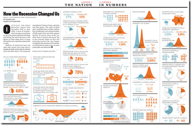
14 Jan 2011I’ve tried to avoid posting most of the trite “end of the year” infographics, but this one from the Atlantic comparing today to before the recession is interesting. (via)
Comment Form
What is Chart Porn?
An addictive collection of beautiful charts, graphs, maps, and interactive data visualization toys -- on topics from around the world.
Categories
- Bailout (118)
- Chartporn Related (3)
- Commentary (21)
- Culture (669)
- Emerging Markets (66)
- Employment (245)
- Environment/weather (133)
- Finance (298)
- Food (92)
- Global Economy (373)
- Graphic Design (bad) (26)
- Graphic Design (general) (183)
- Graphic Tools (23)
- History (158)
- Housing (162)
- Humor (204)
- Innovative (183)
- Interactive (545)
- Internet/tech (97)
- Maps (578)
- News Media (34)
- Politics (329)
- Reference (97)
- Science (331)
- Source: Economist (101)
- Source: FT (92)
- Source: NYT (147)
- Source: Ritholtz (76)
- Source: USA Today (27)
- Source: Washington Post (90)
- Source: WSJ (135)
- Sports (58)
- Stock Market (74)
- Uncategorized (2)
- Updated regularly (76)
- US Economy (553)
- Video (22)
- Aram Korevaar: This chart is now being used as a projection in which countries such as China see themselves as in a [...]
- David: Welcome back Chart Porn! [...]
- J S: Thanks for the great story. Miss reading this blog. Hope to see you more active again. [...]
- jake: I lived in a DC row house for 6 years, and I'm writing this comment from my tiny 1 bedroom apartment [...]
- ronny pettersen: Hilarious and unfortunately accurate... ;-) [...]


3 Responses to How the Recession Changed Us
bob
January 14th, 2011 at 10:08
i think it’s weird that i keep seeing this posted on infographics appreciation blogs. there’s a total misuse of the (appearance of) a gaussian curve in this. Like, why aren’t the charts for things like the federal budget deficit being represented as probability distributions? makes no obvious sense.
Jorge Camoes
January 14th, 2011 at 11:08
Poor pie chart… Now it is used to display percentage increase… (on the left, near the bottom).
bob
January 14th, 2011 at 15:26
*why ARE the charts for things like the federal budget deficit being represented as probability distributions?