Mapping America
15 Dec 2010The NYT’s has created a huge variety of interactive maps based on the Census Bureau’s American Community Survey. Click on “view more maps” to see different breakdowns (income, race, housing, education). Roll-overs popup details at the county or census area level. Related article.
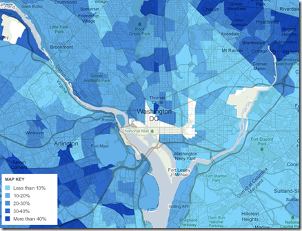
Here’s the percentage of foreign born population in Washington DC:
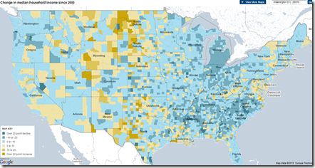
Change in income level since 2000:
This one shows how racially divided DC still is (green vs blue)”:
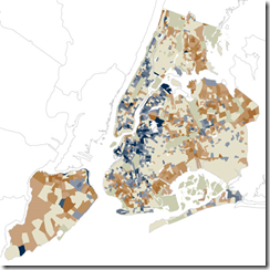
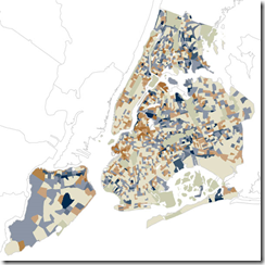
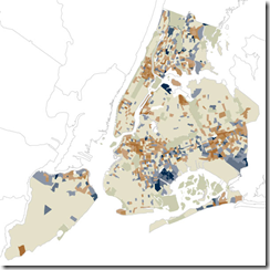
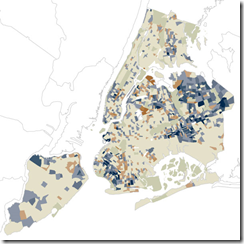
They also used the data for some more detailed analysis, such as “How NYC’s Racial Makeup has changed since 2000” (clockwise from upper left: white, hipanic, asian, black). Related article.
Comment Form
What is Chart Porn?
An addictive collection of beautiful charts, graphs, maps, and interactive data visualization toys -- on topics from around the world.
Categories
- Bailout (118)
- Chartporn Related (3)
- Commentary (21)
- Culture (669)
- Emerging Markets (66)
- Employment (245)
- Environment/weather (133)
- Finance (298)
- Food (92)
- Global Economy (373)
- Graphic Design (bad) (26)
- Graphic Design (general) (183)
- Graphic Tools (23)
- History (158)
- Housing (162)
- Humor (204)
- Innovative (183)
- Interactive (545)
- Internet/tech (97)
- Maps (578)
- News Media (34)
- Politics (329)
- Reference (97)
- Science (331)
- Source: Economist (101)
- Source: FT (92)
- Source: NYT (147)
- Source: Ritholtz (76)
- Source: USA Today (27)
- Source: Washington Post (90)
- Source: WSJ (135)
- Sports (58)
- Stock Market (74)
- Uncategorized (2)
- Updated regularly (76)
- US Economy (553)
- Video (22)
- Aram Korevaar: This chart is now being used as a projection in which countries such as China see themselves as in a [...]
- David: Welcome back Chart Porn! [...]
- J S: Thanks for the great story. Miss reading this blog. Hope to see you more active again. [...]
- jake: I lived in a DC row house for 6 years, and I'm writing this comment from my tiny 1 bedroom apartment [...]
- ronny pettersen: Hilarious and unfortunately accurate... ;-) [...]




1 Response to Mapping America
Nancy Meaker
December 16th, 2010 at 22:36
The one with the median income is so cool. And slightly disturbing.