Deaths in Iraq
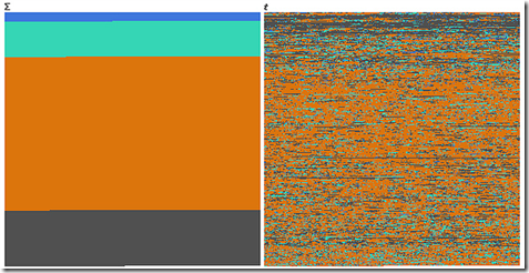
29 Oct 2010An interesting example of how completely different data can look when visualized over time versus when it is categorized.
Blue = *Friendly*, Green = *Host* Nation, Orange = Civilians, Grey = Enemies.
First one is function of sum, second one is function of time, or how you can dilute the media impact of a massacre by killing a few people each day for 6 years.
Based on the Guardian’s analysis of the Wikileaks data.
Comment Form
What is Chart Porn?
An addictive collection of beautiful charts, graphs, maps, and interactive data visualization toys -- on topics from around the world.
Categories
- Bailout (118)
- Chartporn Related (3)
- Commentary (21)
- Culture (669)
- Emerging Markets (66)
- Employment (245)
- Environment/weather (133)
- Finance (298)
- Food (92)
- Global Economy (373)
- Graphic Design (bad) (26)
- Graphic Design (general) (183)
- Graphic Tools (23)
- History (158)
- Housing (162)
- Humor (204)
- Innovative (183)
- Interactive (545)
- Internet/tech (97)
- Maps (578)
- News Media (34)
- Politics (329)
- Reference (97)
- Science (331)
- Source: Economist (101)
- Source: FT (92)
- Source: NYT (147)
- Source: Ritholtz (76)
- Source: USA Today (27)
- Source: Washington Post (90)
- Source: WSJ (135)
- Sports (58)
- Stock Market (74)
- Uncategorized (2)
- Updated regularly (76)
- US Economy (553)
- Video (22)
- Aram Korevaar: This chart is now being used as a projection in which countries such as China see themselves as in a [...]
- David: Welcome back Chart Porn! [...]
- J S: Thanks for the great story. Miss reading this blog. Hope to see you more active again. [...]
- jake: I lived in a DC row house for 6 years, and I'm writing this comment from my tiny 1 bedroom apartment [...]
- ronny pettersen: Hilarious and unfortunately accurate... ;-) [...]


2 Responses to Deaths in Iraq
Scott
October 29th, 2010 at 19:20
There are dozens of graphs and charts based on the new Wikileaks data, but I have yet to see any (recent) treatment of who is killing who. Graphs such as these are inherently political. Doesn’t it matter what percentage of the civilians were killed by insurgents vs. coalition forces, or during sectarian riots?
Joel
November 5th, 2010 at 05:36
If you wanted to get really fancy you could claim it as something akin to a shift from the time domain to the frequency domain.
PS: your tab index in your form does not go from textarea to the “Submit Comment” submission input.