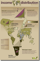
Income Distribution
In: Global Economy Maps
29 Nov 2009Comment Form
What is Chart Porn?
An addictive collection of beautiful charts, graphs, maps, and interactive data visualization toys -- on topics from around the world.
Categories
- Bailout (118)
- Chartporn Related (3)
- Commentary (21)
- Culture (669)
- Emerging Markets (66)
- Employment (245)
- Environment/weather (133)
- Finance (298)
- Food (92)
- Global Economy (373)
- Graphic Design (bad) (26)
- Graphic Design (general) (183)
- Graphic Tools (23)
- History (158)
- Housing (162)
- Humor (204)
- Innovative (183)
- Interactive (545)
- Internet/tech (97)
- Maps (578)
- News Media (34)
- Politics (329)
- Reference (97)
- Science (331)
- Source: Economist (101)
- Source: FT (92)
- Source: NYT (147)
- Source: Ritholtz (76)
- Source: USA Today (27)
- Source: Washington Post (90)
- Source: WSJ (135)
- Sports (58)
- Stock Market (74)
- Uncategorized (2)
- Updated regularly (76)
- US Economy (553)
- Video (22)
- Aram Korevaar: This chart is now being used as a projection in which countries such as China see themselves as in a [...]
- David: Welcome back Chart Porn! [...]
- J S: Thanks for the great story. Miss reading this blog. Hope to see you more active again. [...]
- jake: I lived in a DC row house for 6 years, and I'm writing this comment from my tiny 1 bedroom apartment [...]
- ronny pettersen: Hilarious and unfortunately accurate... ;-) [...]


6 Responses to Income Distribution
Jake
November 30th, 2009 at 08:21
You’re right, it’s an excellent chart. I would have liked to see the “average Gini Coefficient” that the US is above of. How would you calculate that? The sum of the Gini Coefficients divided by the number of countries? Or weighed by population of the respective countries? Or by the income generated in each country?
On a side note: The link is broken.
Tomas
November 30th, 2009 at 10:25
One of the clearest wrong definitions, that is.
Tim
November 30th, 2009 at 11:28
I really can’t tell. The link is broken.
Don Gray
November 30th, 2009 at 12:14
The link to the chart is http://www.visualeconomics.com/income-distribution-by-country/
Tim
November 30th, 2009 at 12:44
Thank you. When you run your cursor over the image, you get what looks like a partially-doubled address.
Dustin
November 30th, 2009 at 23:25
Fixed.