What is Chart Porn?
An addictive collection of beautiful charts, graphs, maps, and interactive data visualization toys -- on topics from around the world.
Categories
- Bailout (118)
- Chartporn Related (3)
- Commentary (21)
- Culture (669)
- Emerging Markets (66)
- Employment (245)
- Environment/weather (133)
- Finance (298)
- Food (92)
- Global Economy (373)
- Graphic Design (bad) (26)
- Graphic Design (general) (183)
- Graphic Tools (23)
- History (158)
- Housing (162)
- Humor (204)
- Innovative (183)
- Interactive (545)
- Internet/tech (97)
- Maps (578)
- News Media (34)
- Politics (329)
- Reference (97)
- Science (331)
- Source: Economist (101)
- Source: FT (92)
- Source: NYT (147)
- Source: Ritholtz (76)
- Source: USA Today (27)
- Source: Washington Post (90)
- Source: WSJ (135)
- Sports (58)
- Stock Market (74)
- Uncategorized (2)
- Updated regularly (76)
- US Economy (553)
- Video (22)
- Aram Korevaar: This chart is now being used as a projection in which countries such as China see themselves as in a [...]
- David: Welcome back Chart Porn! [...]
- J S: Thanks for the great story. Miss reading this blog. Hope to see you more active again. [...]
- jake: I lived in a DC row house for 6 years, and I'm writing this comment from my tiny 1 bedroom apartment [...]
- ronny pettersen: Hilarious and unfortunately accurate... ;-) [...]


3 Responses to Motorcycle Fatalities
Jake
November 10th, 2009 at 15:50
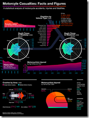
I’m a bit suspicious about this chart. I feel like there’s a clear agenda (making the point that motorcycle accidents are less frequent than commonly believed). Was that in the bar chart in the top center, there’s two categories “Motorcycle” and “Motorcycles”. I don’t think that these categories actually represent different things and should indeed be merged. That would put “Motorcycle(s)” fourth, behind the “4-Door Sedan” and before “Other Vehicles”. Am I seeing things here or is there a good explanation? Is it just my paranoia?
Jamie
November 10th, 2009 at 16:18
@Jake,
I’d say you’re right to be suspicious. While it is pretty, it is definitely more ‘porn’ than information.
Some information is from 2007, some from 2008. Total fatalities is for a different range of years than total injuries (and is it 100 million motocycle miles or, all miles?). It’s hard to know if the total fatalities for motocycles adds up between the bar chart and the spoke graphs (the wheels). It’s impossible to know if the injuries/fatalities are high or low compared to car injuries/fatalities (are you more likely to die on a motocycle?)
Same with the helmeted/non-helmeted percentages – would be nice to know percentage of people that wear helmets (so one can get a sense for whether you’re more likely to die without a helmet).
Still, it does look lovely.
#1084: CoverTuned
November 11th, 2009 at 09:04
[…] seems that the time of day affects the chance of an accident, as does the weather forecast, driver details and the maintenance history of the […]