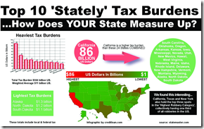
State Taxes
In: US Economy
3 Nov 2009Comment Form
What is Chart Porn?
An addictive collection of beautiful charts, graphs, maps, and interactive data visualization toys -- on topics from around the world.
Categories
- Bailout (118)
- Chartporn Related (3)
- Commentary (21)
- Culture (669)
- Emerging Markets (66)
- Employment (245)
- Environment/weather (133)
- Finance (298)
- Food (92)
- Global Economy (373)
- Graphic Design (bad) (26)
- Graphic Design (general) (183)
- Graphic Tools (23)
- History (158)
- Housing (162)
- Humor (204)
- Innovative (183)
- Interactive (545)
- Internet/tech (97)
- Maps (578)
- News Media (34)
- Politics (329)
- Reference (97)
- Science (331)
- Source: Economist (101)
- Source: FT (92)
- Source: NYT (147)
- Source: Ritholtz (76)
- Source: USA Today (27)
- Source: Washington Post (90)
- Source: WSJ (135)
- Sports (58)
- Stock Market (74)
- Uncategorized (2)
- Updated regularly (76)
- US Economy (553)
- Video (22)
- Aram Korevaar: This chart is now being used as a projection in which countries such as China see themselves as in a [...]
- David: Welcome back Chart Porn! [...]
- J S: Thanks for the great story. Miss reading this blog. Hope to see you more active again. [...]
- jake: I lived in a DC row house for 6 years, and I'm writing this comment from my tiny 1 bedroom apartment [...]
- ronny pettersen: Hilarious and unfortunately accurate... ;-) [...]


5 Responses to State Taxes
Matt H
November 3rd, 2009 at 13:54
Strange, that picture looks a lot like this one.. I wonder if they’re correlated?
http://en.wikipedia.org/wiki/File:USA_states_population_map_2007_color.svg
David
November 3rd, 2009 at 14:44
Stunningly bad.
Harlan
November 3rd, 2009 at 15:23
Who’s vetting these graphs? This is terribly misleading, the worst sort of lying with statistics.
Dustin
November 3rd, 2009 at 17:24
The source of the data is indicated on the infographic. I don’t have the time (or the interest) in vetting every chart. If you find something specific you think is wrong or mislabeled please let the rest of us know.
Courtney
November 25th, 2009 at 07:26
Excellent example of how visual data can be used to mislead. We should always be skeptical of eye-catching but meaningless charts like this one that ignore the commonly understood sense of “tax burden” by not taking population into account.
Would love to see this with actual meaningful info and minus the random and equally meaningless “scare info” in the bottom right.