Construction Jobs
5 Oct 2009Comment Form
What is Chart Porn?
An addictive collection of beautiful charts, graphs, maps, and interactive data visualization toys -- on topics from around the world.
Categories
- Bailout (118)
- Chartporn Related (3)
- Commentary (21)
- Culture (669)
- Emerging Markets (66)
- Employment (245)
- Environment/weather (133)
- Finance (298)
- Food (92)
- Global Economy (373)
- Graphic Design (bad) (26)
- Graphic Design (general) (183)
- Graphic Tools (23)
- History (158)
- Housing (162)
- Humor (204)
- Innovative (183)
- Interactive (545)
- Internet/tech (97)
- Maps (578)
- News Media (34)
- Politics (329)
- Reference (97)
- Science (331)
- Source: Economist (101)
- Source: FT (92)
- Source: NYT (147)
- Source: Ritholtz (76)
- Source: USA Today (27)
- Source: Washington Post (90)
- Source: WSJ (135)
- Sports (58)
- Stock Market (74)
- Uncategorized (2)
- Updated regularly (76)
- US Economy (553)
- Video (22)
- Aram Korevaar: This chart is now being used as a projection in which countries such as China see themselves as in a [...]
- David: Welcome back Chart Porn! [...]
- J S: Thanks for the great story. Miss reading this blog. Hope to see you more active again. [...]
- jake: I lived in a DC row house for 6 years, and I'm writing this comment from my tiny 1 bedroom apartment [...]
- ronny pettersen: Hilarious and unfortunately accurate... ;-) [...]


2 Responses to Construction Jobs
derek
October 5th, 2009 at 09:50
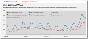
That’s a really stupid scale on the lower chart. Jan-00, Jun-02, Nov-04, Apr-07? How is anyone expected to work out the seasonal variation in unemployment from that? The ticks should have been at 12 month intervals, labeled every two or three years with the same month, preferably the month of the typical peak or trough.
Dustin
October 5th, 2009 at 10:32
Derek, I agree the labeling is poor — but did you notice that the axis labels are also interactive? (the month of each datapoint popup as you cursor along the axis). I think shading the years vertically might have worked well in this case.