Development aid
In: Global Economy Maps
18 Aug 2009Comment Form
What is Chart Porn?
An addictive collection of beautiful charts, graphs, maps, and interactive data visualization toys -- on topics from around the world.
Categories
- Bailout (118)
- Chartporn Related (3)
- Commentary (21)
- Culture (669)
- Emerging Markets (66)
- Employment (245)
- Environment/weather (133)
- Finance (298)
- Food (92)
- Global Economy (373)
- Graphic Design (bad) (26)
- Graphic Design (general) (183)
- Graphic Tools (23)
- History (158)
- Housing (162)
- Humor (204)
- Innovative (183)
- Interactive (545)
- Internet/tech (97)
- Maps (578)
- News Media (34)
- Politics (329)
- Reference (97)
- Science (331)
- Source: Economist (101)
- Source: FT (92)
- Source: NYT (147)
- Source: Ritholtz (76)
- Source: USA Today (27)
- Source: Washington Post (90)
- Source: WSJ (135)
- Sports (58)
- Stock Market (74)
- Uncategorized (2)
- Updated regularly (76)
- US Economy (553)
- Video (22)
- Aram Korevaar: This chart is now being used as a projection in which countries such as China see themselves as in a [...]
- David: Welcome back Chart Porn! [...]
- J S: Thanks for the great story. Miss reading this blog. Hope to see you more active again. [...]
- jake: I lived in a DC row house for 6 years, and I'm writing this comment from my tiny 1 bedroom apartment [...]
- ronny pettersen: Hilarious and unfortunately accurate... ;-) [...]


1 Response to Development aid
bill
September 8th, 2009 at 18:37
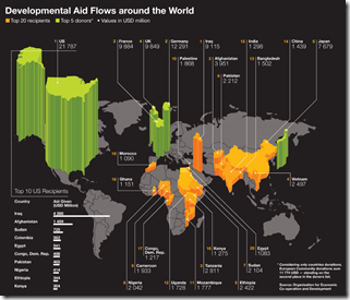
I disagree with your rationale for an interactive version. If that were the case you could view one data point at a time. This allows for you to attempt a comparison.
But… the 3D is pretty useless since it is difficult to compare height against a fixed line, the countries being on a plane.
It took a moment of reading the graph to understand the numbers at the end of the lines when compared to the histogram in the lower left of the chart.
Ultimately, this chart fails to communicate as much information as it could by opting for a flashy visual style and forcing the combined contributions of the UK, Germany, France and Japan to be computed rather than stated directly.