Bad Time to Graduate
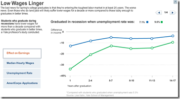
15 May 2009“The bad news for spring’s college graduates is that they’re entering the toughest labor market in at least 25 years. The worse news: Even those who do land jobs will likely suffer lower wages for a decade or more.” Related article. Tab through related stats in the below graphic:
Comment Form
What is Chart Porn?
An addictive collection of beautiful charts, graphs, maps, and interactive data visualization toys -- on topics from around the world.
Categories
- Bailout (118)
- Chartporn Related (3)
- Commentary (21)
- Culture (669)
- Emerging Markets (66)
- Employment (245)
- Environment/weather (133)
- Finance (298)
- Food (92)
- Global Economy (373)
- Graphic Design (bad) (26)
- Graphic Design (general) (183)
- Graphic Tools (23)
- History (158)
- Housing (162)
- Humor (204)
- Innovative (183)
- Interactive (545)
- Internet/tech (97)
- Maps (578)
- News Media (34)
- Politics (329)
- Reference (97)
- Science (331)
- Source: Economist (101)
- Source: FT (92)
- Source: NYT (147)
- Source: Ritholtz (76)
- Source: USA Today (27)
- Source: Washington Post (90)
- Source: WSJ (135)
- Sports (58)
- Stock Market (74)
- Uncategorized (2)
- Updated regularly (76)
- US Economy (553)
- Video (22)
- Aram Korevaar: This chart is now being used as a projection in which countries such as China see themselves as in a [...]
- David: Welcome back Chart Porn! [...]
- J S: Thanks for the great story. Miss reading this blog. Hope to see you more active again. [...]
- jake: I lived in a DC row house for 6 years, and I'm writing this comment from my tiny 1 bedroom apartment [...]
- ronny pettersen: Hilarious and unfortunately accurate... ;-) [...]


1 Response to Bad Time to Graduate
Michael Pierce
May 15th, 2009 at 11:29
Interesting (and concerning) information, but I really don’t like the charts they put together.
Chart #1: I had to read the source footnote before I actually understood what the chart meant. My first reaction was difference in income compared to what? Especially with both lines on the chart below zero for the entire duration. It would have been helpful if they included a line on the chart to represent the comparison group as well.
Chart #2: Complete mish-mosh of a bar chart with such subtle differences year over year that I can’t really discern a trend except that it looks to be slightly down since 2003. Would be helpful if the like categories were grouped together so you could see the difference (i.e. put all of the male high school grads together and put that grouping next to the female high school grads). Also having the most recent year at the top is counter intuitive. At first I thought the trend was upward not down!
Chart #3: What a mess. I have no idea what the age breakdown does to enhance the story; just adds more bars and makes it harder to read. The categories make no sense whatsoever with tons of overlap among them. How can one category be “Some college or associate degree” and another is “Associate degree”? Or “Less than a high school diploma” and “1-3 years of high school”? Aren’t those the same?
Chart #4: Is this a chart to show people are “opting out of the recession” or does it show that their on-line adoption rate is better? Why only highlight the fact that on-line applications are increasing? Are paper ones increasing as well? Or are there just more people with access to on-line services now? Or did AmeriCorps abolish paper applications forcing an increase in on-line usage?
All-in-all messy charts that don’t focus on telling one story.
[Just my 2 cents…maybe I’m just grumpy at the end of the week. :-)]