Archive for May, 2009
US Job Forecast (4/24/09 update)
In: Employment Interactive Maps Source: USA Today US Economy
11 May 2009Highly interactive display (by sector, region, time) of Moody’s forecast for US employment through 2012.

The Aging World
11 May 2009If recent economic data isn’t depressing enough, here’s some from the future to remind you that everyone has some nice Malthusian demographic mountains to climb in the next 20+ years.

Green Shoots Nonsense?
11 May 2009More statistical games with April’s employment numbers. The mainstream media have focused on the numbers being “good” because they aren’t falling as fast as previous months (a bit of a reach, IMHO). But several bloggers have pointed out that the 539,000 job losses only look good because of government hiring for the census. otherwise the losses are 611,000. Here is EconomPic’s graph:

Red tape and guidelines vary widely across the US. Related article.


Follow the Sub-Prime Money
11 May 2009Interactive summary of $370 million in US campaign contributions made by originators of sub-prime mortgages, 1994-2008. Related article.


Stress Test Results (more)
11 May 2009The FT’s version:

Bank Stress Test Results
11 May 2009Interactive comparison of the banks by indicator:

GDP for Beginners
5 May 2009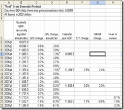 Joseph Kwak over at The Baseline Scenario has a nice explanation of how GDP is calculated, and what all those different growth rates you read in the paper mean. Of course, you could go to wikipedia for more wonk.
Executive Compensation 2008
In: Bailout Employment Finance Interactive Source: USA Today US Economy
5 May 2009A nice presentation from USA today which shows salary, bonuses, stock options, other compensation. versus stock performance. Also allows you to filter by industry using the tabs at top. Related article.

The Seven Deadly Sins
5 May 2009


Greed was calculated by comparing average incomes with the total number of inhabitants living beneath the poverty line. Envy was calculated using the total number of thefts – robbery, burglary, larceny and stolen cars. Wrath was calculated by comparing the total number of violent crimes – murder, assault and rape – reported to the FBI per capita. Lust was calculated by compiling the number of sexually transmitted diseases – HIV, AIDS, syphilis, chlamydia and gonorrhea – reported per capita. Gluttony was calculated by counting the number of fast food restaurants per capita. Sloth was calculated by comparing expenditures on arts, entertainment and recreation with the rate of employment. And pride, lastly, is most important. The root of all sins, in this study, is the aggregate of all data. Vought and his Kansas colleagues combined all data from the six other sins and averaged it into an overview of all evil.
Related article with more details. (I couldn’t find the original study "The Spatial Distribution of the Seven Deadly Sins within Nevada” from Kansas State University)
The Fed’s Trillion
5 May 2009A nice breakdown of the Fed’s facilities.

Execute Compensation
1 May 2009Two nice infographics on CEO pay (the one on the right is interactive)


What is Chart Porn?
An addictive collection of beautiful charts, graphs, maps, and interactive data visualization toys -- on topics from around the world.
Categories
- Bailout (118)
- Chartporn Related (3)
- Commentary (21)
- Culture (669)
- Emerging Markets (66)
- Employment (245)
- Environment/weather (133)
- Finance (298)
- Food (92)
- Global Economy (373)
- Graphic Design (bad) (26)
- Graphic Design (general) (183)
- Graphic Tools (23)
- History (158)
- Housing (162)
- Humor (204)
- Innovative (183)
- Interactive (545)
- Internet/tech (97)
- Maps (578)
- News Media (34)
- Politics (329)
- Reference (97)
- Science (331)
- Source: Economist (101)
- Source: FT (92)
- Source: NYT (147)
- Source: Ritholtz (76)
- Source: USA Today (27)
- Source: Washington Post (90)
- Source: WSJ (135)
- Sports (58)
- Stock Market (74)
- Uncategorized (2)
- Updated regularly (76)
- US Economy (553)
- Video (22)
- Aram Korevaar: This chart is now being used as a projection in which countries such as China see themselves as in a [...]
- David: Welcome back Chart Porn! [...]
- J S: Thanks for the great story. Miss reading this blog. Hope to see you more active again. [...]
- jake: I lived in a DC row house for 6 years, and I'm writing this comment from my tiny 1 bedroom apartment [...]
- ronny pettersen: Hilarious and unfortunately accurate... ;-) [...]